Blue Print + SURTEX = 100% SUCCESS!

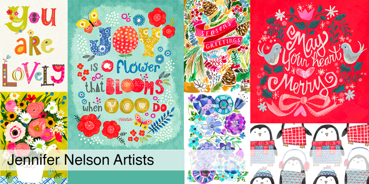
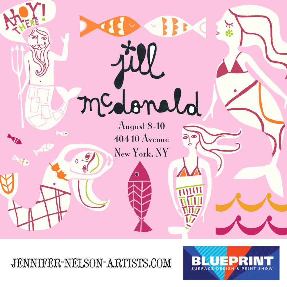
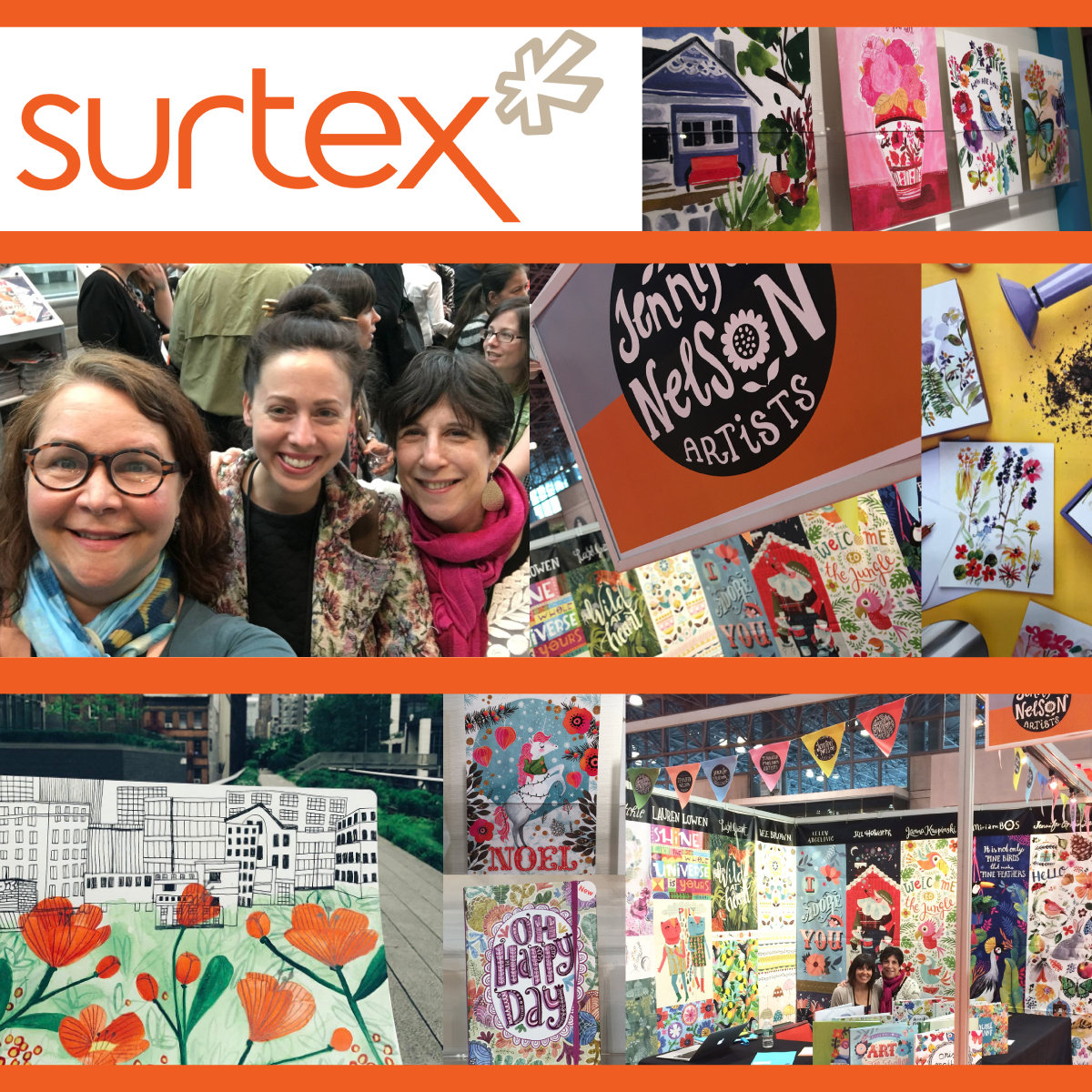
We had an absolutely amazing time in NYC at Blue Print and SURTEX. It was great to see old friends and to make some new ones. Our little agency sold or licensed art for use in all these categories: bedding, greeting cards, journals, tea towels, decorative pillows, wallpaper and many more. Plus, we received loads of smiles and compliments. It was very gratifying.
 
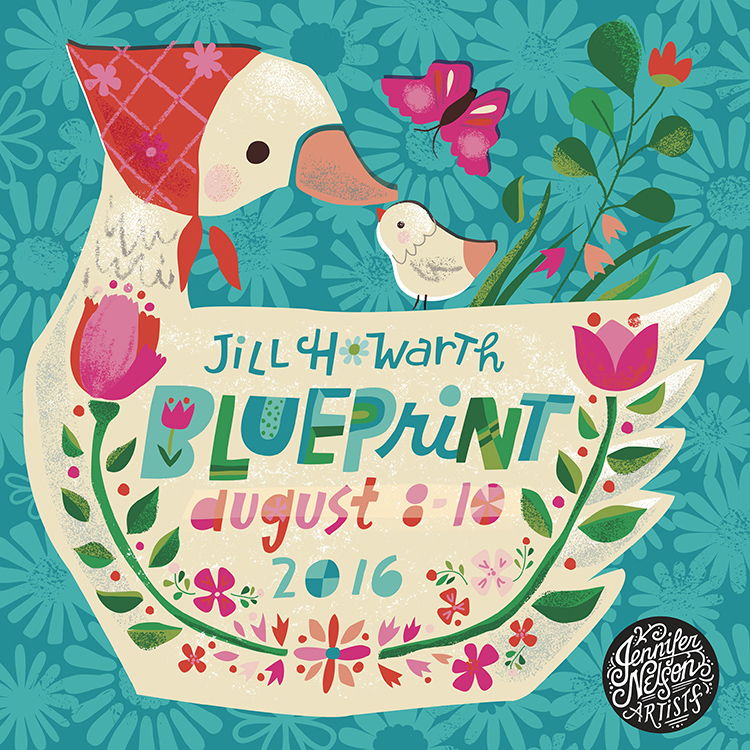
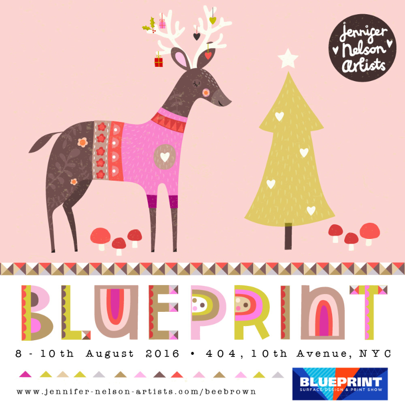
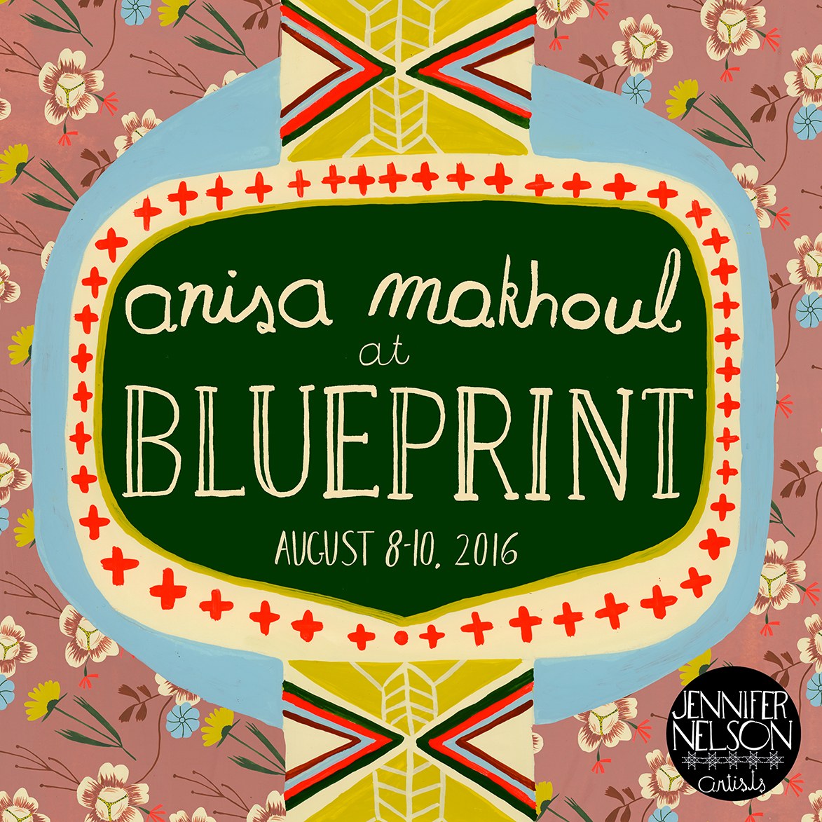
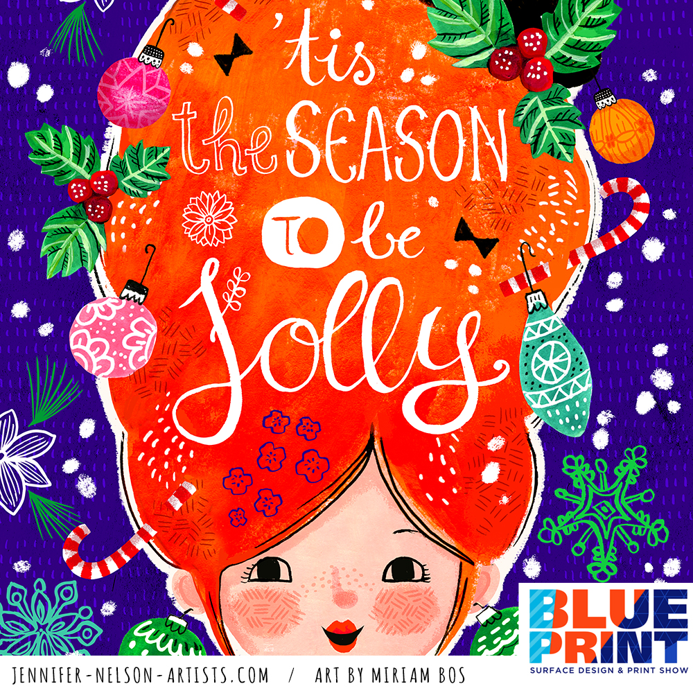
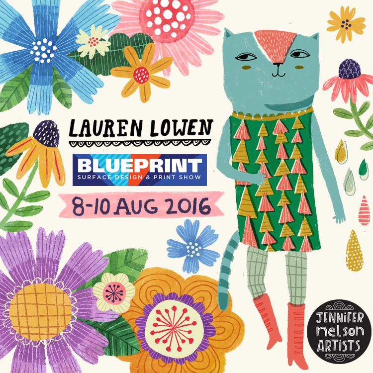
I was so proud of my wonderful artists Rae Ritchie, Anisa Makhoul, Jennifer Orkin Lewis, and Kelly Angelovic who were able to attend the shows and share the excitement with me. (Maybe next time we can include the equally excellent Miriam Bos, Rachel Grant, Lauren Lowen, Jill Howarth, Bee Brown, and Janna Krupinksi.)


I wanted to spend time with each of you individually, but sometimes there was literally a line of people waiting to see us (!) and I wasn’t able to get to everyone. I’m truly sorry about that.


If you purchased some art at the shows, I’ll process that for you very soon. If you requested a custom gallery I’ll get back to you with that just as quickly as possible.
 
Thank you so much for making this our best year ever! - Jennifer

Sweetness + cozy domestic bliss = Rachel Grant's portfolio book!

With BLUE PRINT + SURTEX just around the corner I want to share the artists' portfolio books! Rachel Grant brings it all home with her mesmerizing work - a first timer at the shows and she promises to delight! Want to see work before the show, just ask! Enjoy - Jennifer

Anisa's stunning portfolio book!

As we are getting ready for BLUE PRINT + SURTEX in May, I want to share the artists' portfolio books! First up, the über-talent, Anisa Makhoul! Want to see work before the show, just ask! Enjoy - Jennifer

BLUE PRINT is just around the corner!

Jennifer Nelson Artists, will be exhibiting at the upcoming Blue Print Surface Design and Print Show in New York City on August 8-10th, 2016. 

Artwork left to right: Bee Brown, Anisa Makhoul, Miriam Bos, Jennifer Orkin Lewis, Jill McDonald, Jill Howarth and Lauren Lowen.

Artwork left to right: Bee Brown, Anisa Makhoul, Miriam Bos, Jennifer Orkin Lewis, Jill McDonald, Jill Howarth and Lauren Lowen.

“Blue Print is a very important show for us, since it focuses exactly on what we do,” said Jennifer Nelson from her Boston-area office. “Meeting with companies in these industries is essential to our business.”

Creating, licensing and selling art for surface design and print products is at the core of their operation at Jennifer Nelson Artists. Representing seven top illustrators, JNA specializes in a quirky, feminine look that is popular on all sorts of goods from greeting cards to dish towels. “We know that our customers will be at Blue Print and we look forward to seeing them again and showing off some of our artists’ latest work.” 

Launched in January of 2015, Jennifer Nelson Artists already boasts a roster of top illustrators: Anisa MakhoulBee BrownJennifer Orkin Lewis,Jill HowarthJill McDonaldLauren Lowen, and introducing Miriam Bos

Jennifer Nelson Artists is a Boston-based illustration agency representing talented artists whose work is available for licensing, purchasing as well as commissions. JNA can be reached at (781) 643-2002, on Instagram or by email.


SHOW DATES:
August 8-10, 2016

SHOW TIMES:
Monday, August 8th - 9:00-6:00
Tuesday, August 9th- 9:00-6:00
Wednesday, August 10th- 9:00-6:00

LOCATION: 
404 Tenth Avenue
(between 32nd and 33rd Streets)
New York, NY 10001


Lauren Lowen’s Blueprint Show Poster (And 4 Fun Facts About It!)

Hello! I am so happy to show the poster I designed for Blueprint’s third (yes, third!) show coming up this May 12-16 in New York City. Everyone at Jennifer Nelson Artists was honored to have one of us create it. Paul Turk, the show organizer and also awesome Big Cheese of Cinnamon Joe, gave me a lot of freedom. I designed two sketches which you can see here, and Paul selected the busy New York scene, which totally captures the energy of both the city and Blueprint.

I have always had a soft spot for posters. In fact, a common assignment I would give to my pre-college students was to do a mock poster for a favorite musician or band. They’re just so much fun! I love the chance to combine my lettering and illustration into a piece, so this project was perfect for me.  Luckily, the hand lettering contributed to the feeling Paul was going for- that handmade, raw kind of look that’s full of texture. He’s so on trend!

When designing a poster, it’s important to remember that the main function is all about communication. If the viewer can’t get the info they need almost instantly, it fails. When designing, I knew the exhibitor names and show information had to be clear and obvious. Of course, little Lauren Lowen just had to be ambitious and submit a really busy, colorful idea! But by making sure the lettering dominated first, I was able to have fun with everything else and it all came together. To help the message, I made sure to keep the Blueprint header design and color scheme it has had the last two shows. By keeping the same look and just doing a more hand done version, I kept the branding intact (I also kept the staggering blue and orange exhibitor names as a call back to previous posters). Since we wanted to hand letter the exhibitor names,  I used Myriad Pro as my “skeleton” in Photoshop and hand drew on top. I got a completely original font out of it that fits the poster, but this step made sure that the names were somewhat consistent and easier to read.

Here are 4 Fun facts about the poster you probably didn’t know!

  1. The 615 on the taxi is a shout out to Nashville’s area code. I am based right outside Music City (and yes, my husband is a musician. I can play classical kazoo, thank you).
  2. The mermaid was inspired by urban legends speculating what lurks underneath the streets of New York City. While most stories talk about huge abandoned pet alligators or radioactive rats, I decided it would be fun to have a more fantastical interpretation.
  3.  Originally I wanted to draw Paul as the taxi driver, but I thought he might be shy about that idea. I have always loved Paul’s moustache, so the Walrus because a sort of avatar for him (the walrus is the moustache champ of the animal kingdom). I’m not saying Paul looks like a walrus, mind you. No. Also, this is a very handsome, classy Walrus. He’s well read and knows his fine wines (and drives a taxi, apparently).
  4.  Paul and I have actually crossed paths before when I was an in-house designer at a large paper & gift company. It was always a good day when he would visit our art department!

I hope you have enjoyed reading about the process behind the Blueprint Show poster. Jennifer Nelson Artists will be there this May, so please say hello and schedule an appointment with us! - Lauren