Lauren Lowen’s Tokyo Adventure

Hello everyone! I just got back from Tokyo and had an AMAZING time. This was my third time visiting Japan and my husband’s second.  Read on to see some of my favorite photos and hear what we did!

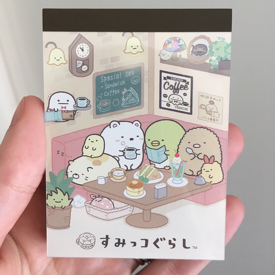
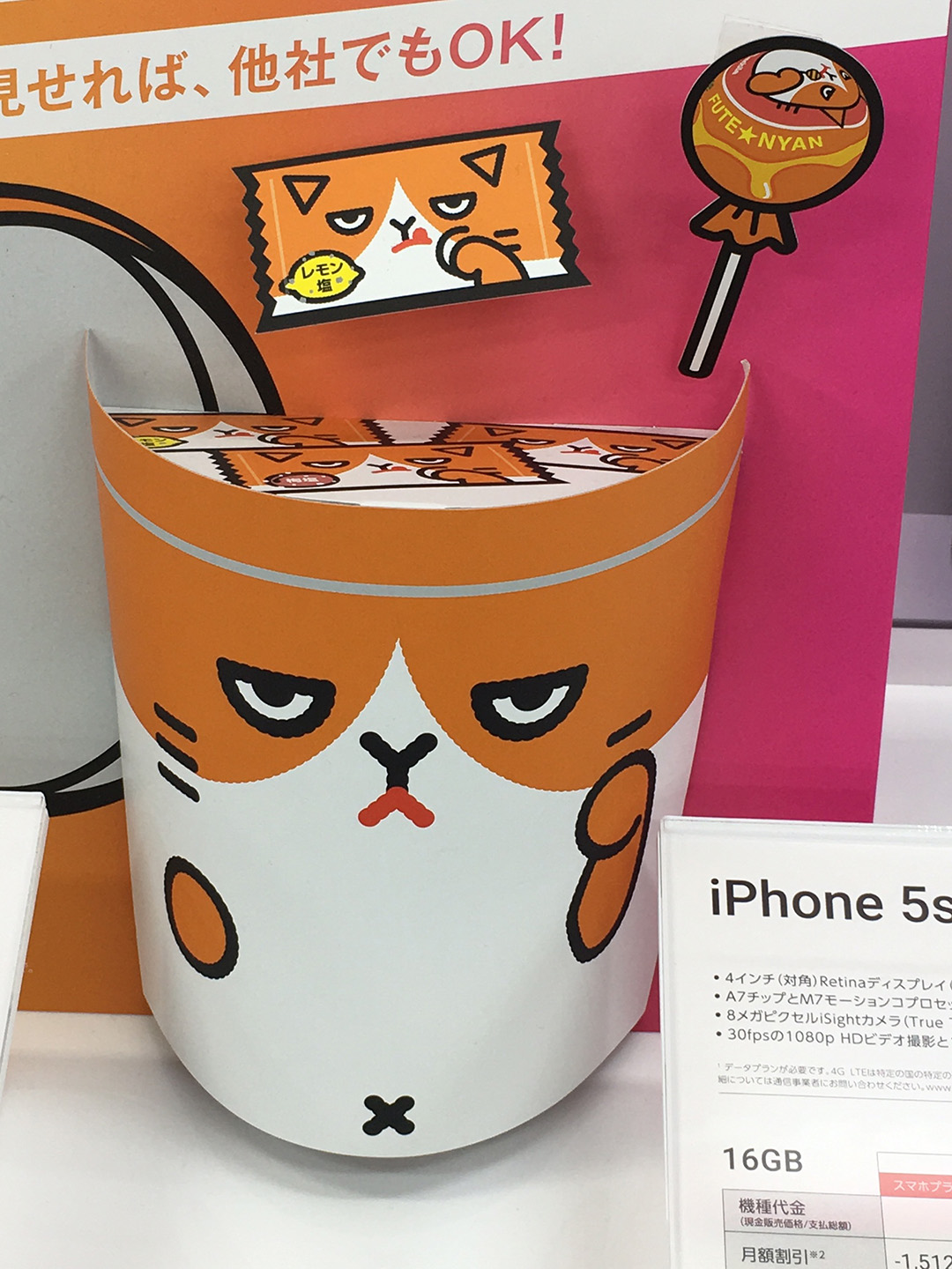
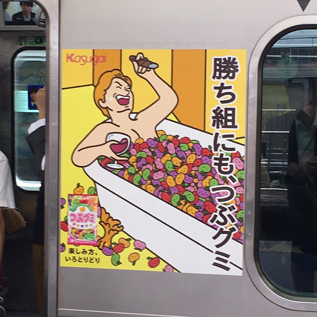
First of all, Japan has all sorts of fun packaging, products and graphics. Here’s just a sampling of some of the uber cute things we saw.


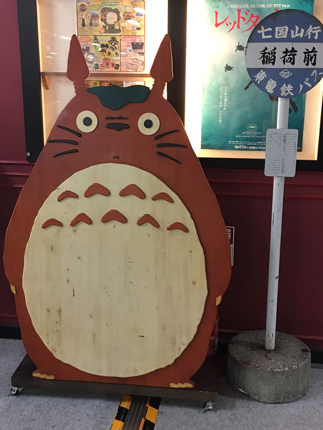
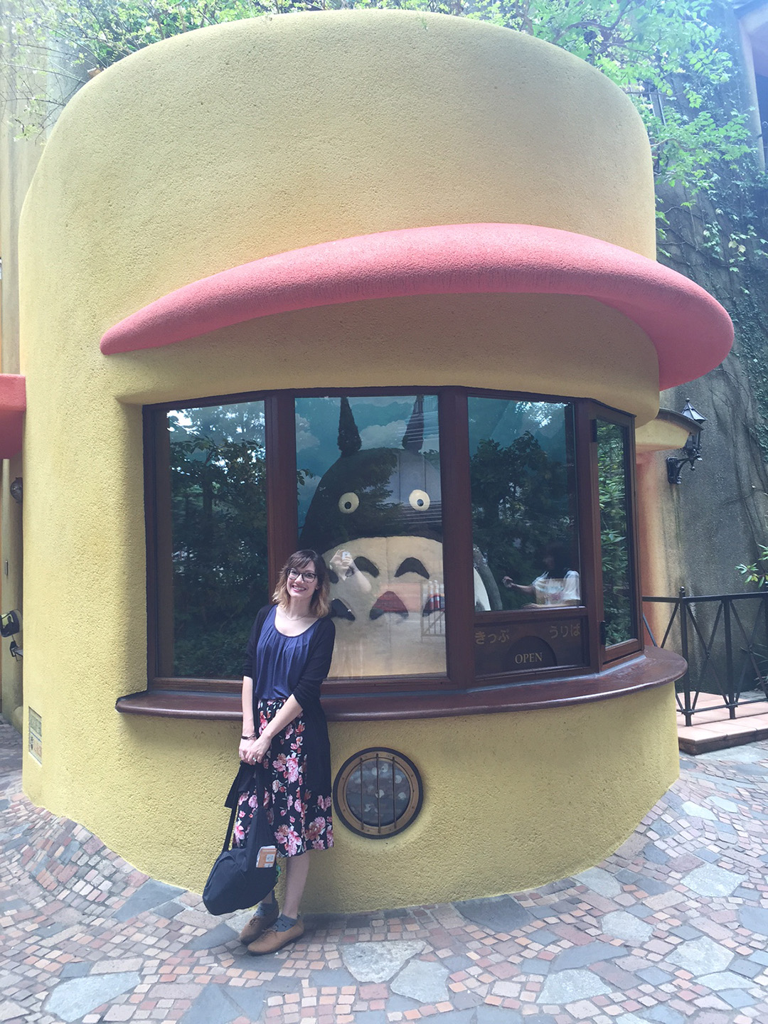
One of the places I really wanted to visit was the Ghibli Museum, a wonderful space dedicated to the studio famous for their films by Hayao Miyazaki (My Neighbor Totoro , Spirited Away) . You have to get tickets way in advance, so acquiring them was extremely stressful. Just imagine me stalking my computer for the very second the next batch of tickets were available online! They have a pretty strict “no photo” policy, but you are able to get a picture of yourself and Totoro at the museum entrance.

Another adventure was visiting an onsen (traditional hot spring bathhouse). It was pure coincidence that we went to the same onsen I visited about ten years ago on my last trip. There is a communal area where you can get food, buy souvenirs, and even play games.  After a quick bite to eat and some browsing, Keith and I said bye for a while and went to relax in our designated bathing areas. By then we were very tired after a few days of intense walking, so we really needed it!

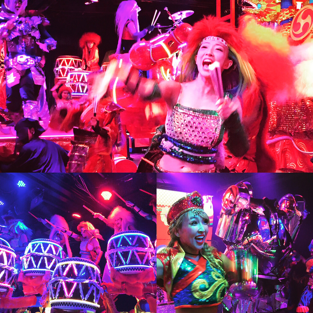
The wackiest destination was probably The Robot Restaurant. Keith was very excited to do this, and I can only describe it as part live theatre, part crazy parade, and all the insane stuff you imagine in Japanese pop culture.

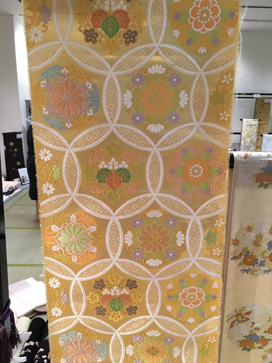
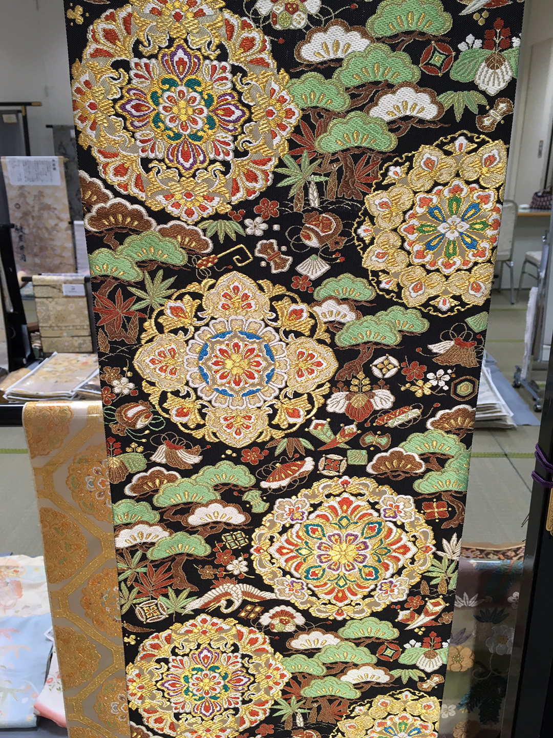
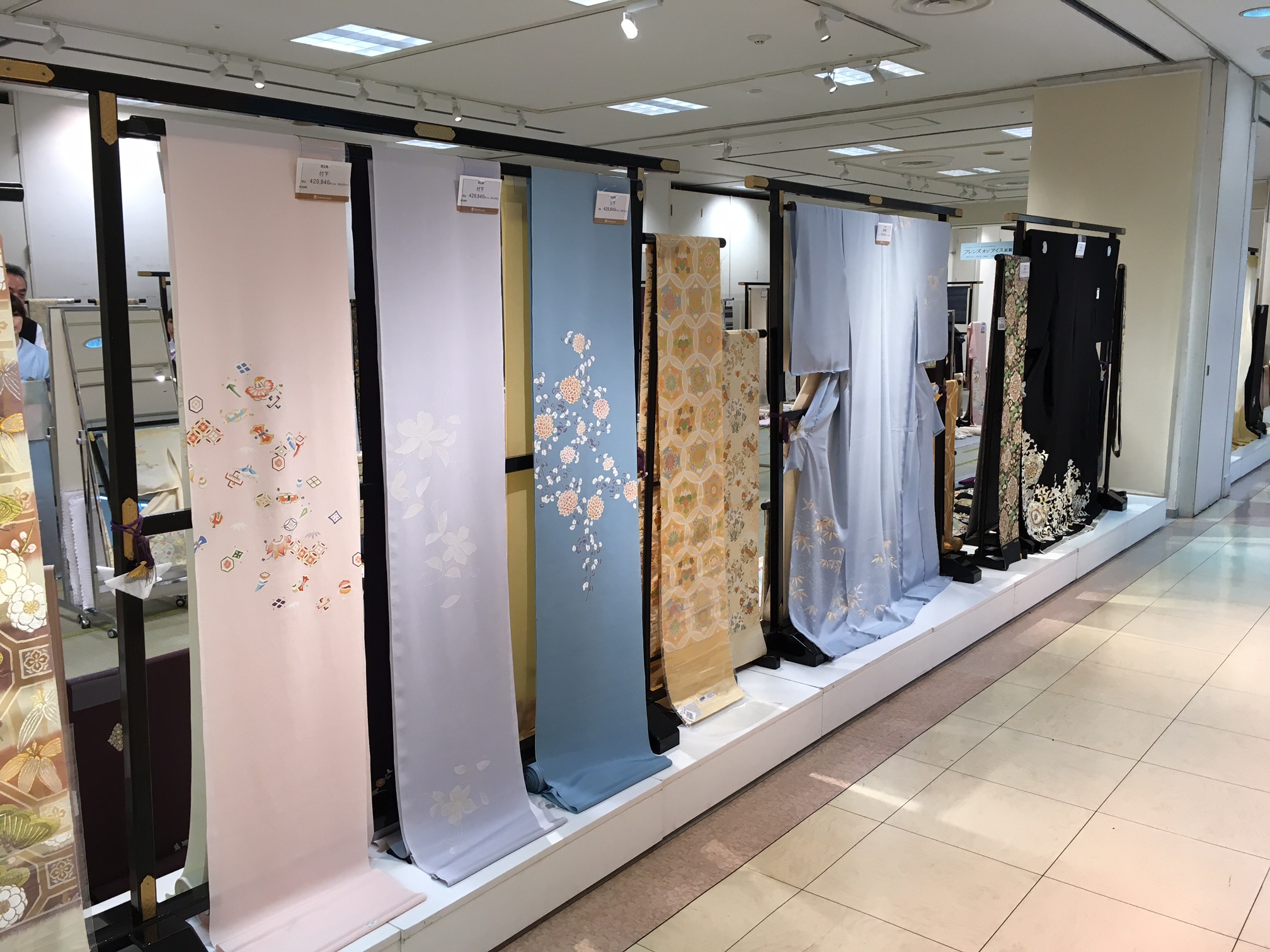
One of the things I had never done during my previous visits was explore a department store. They are known for having large food halls below (delicious!) and I was lucky enough to stumble upon some beautiful house goods, stationery, and other products. Check out these photos of the kimono section in one store. (You are looking at a $15,000 garment; the obis on display range from $3000-$5000 if you’re wondering! Absolutely beautiful.)

All the experiences were so incredible. In the end I picked up a few items for myself, with lots more being purchased for friends and family.  Keith and I had a great time, but have to admit we were ready to go home by the last day…only because our feet couldn’t take it anymore!

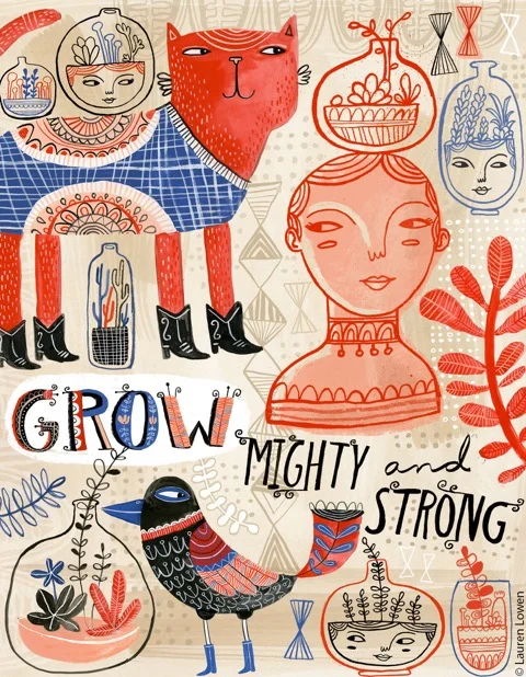
The trip was relaxing and inspiring. After taking all those beautiful photographs I can't wait to create some images with my paints! - Lauren

Lauren Lowen’s Blueprint Show Poster (And 4 Fun Facts About It!)

Hello! I am so happy to show the poster I designed for Blueprint’s third (yes, third!) show coming up this May 12-16 in New York City. Everyone at Jennifer Nelson Artists was honored to have one of us create it. Paul Turk, the show organizer and also awesome Big Cheese of Cinnamon Joe, gave me a lot of freedom. I designed two sketches which you can see here, and Paul selected the busy New York scene, which totally captures the energy of both the city and Blueprint.

I have always had a soft spot for posters. In fact, a common assignment I would give to my pre-college students was to do a mock poster for a favorite musician or band. They’re just so much fun! I love the chance to combine my lettering and illustration into a piece, so this project was perfect for me.  Luckily, the hand lettering contributed to the feeling Paul was going for- that handmade, raw kind of look that’s full of texture. He’s so on trend!

When designing a poster, it’s important to remember that the main function is all about communication. If the viewer can’t get the info they need almost instantly, it fails. When designing, I knew the exhibitor names and show information had to be clear and obvious. Of course, little Lauren Lowen just had to be ambitious and submit a really busy, colorful idea! But by making sure the lettering dominated first, I was able to have fun with everything else and it all came together. To help the message, I made sure to keep the Blueprint header design and color scheme it has had the last two shows. By keeping the same look and just doing a more hand done version, I kept the branding intact (I also kept the staggering blue and orange exhibitor names as a call back to previous posters). Since we wanted to hand letter the exhibitor names,  I used Myriad Pro as my “skeleton” in Photoshop and hand drew on top. I got a completely original font out of it that fits the poster, but this step made sure that the names were somewhat consistent and easier to read.

Here are 4 Fun facts about the poster you probably didn’t know!

  1. The 615 on the taxi is a shout out to Nashville’s area code. I am based right outside Music City (and yes, my husband is a musician. I can play classical kazoo, thank you).
  2. The mermaid was inspired by urban legends speculating what lurks underneath the streets of New York City. While most stories talk about huge abandoned pet alligators or radioactive rats, I decided it would be fun to have a more fantastical interpretation.
  3.  Originally I wanted to draw Paul as the taxi driver, but I thought he might be shy about that idea. I have always loved Paul’s moustache, so the Walrus because a sort of avatar for him (the walrus is the moustache champ of the animal kingdom). I’m not saying Paul looks like a walrus, mind you. No. Also, this is a very handsome, classy Walrus. He’s well read and knows his fine wines (and drives a taxi, apparently).
  4.  Paul and I have actually crossed paths before when I was an in-house designer at a large paper & gift company. It was always a good day when he would visit our art department!

I hope you have enjoyed reading about the process behind the Blueprint Show poster. Jennifer Nelson Artists will be there this May, so please say hello and schedule an appointment with us! - Lauren

“Hey Lauren, How Do You Make Your Work?”

A long time ago (ok, not THAT long ago) I found myself pondering the same conundrum many artists do at some point (or at many points) in their lives. The question was how should I actually make my art? Hand-done with my trusty gouache or with the magic box known as the computer? And - OH - the stress! You would think I was making the most important decision in my life. Truly, it would drive me bonkers at times. 

Years ago, I was pretty much doing 95% of my work with paint. Sure, I had some Adobe Photoshop and Illustrator savvy; I had even done some client work that was all-digital to test the waters, but I was still definitely not what I would consider a “digital artist” at this point.  Even more frustrating was that my work was so flat and smooth that most people thought my gouache paintings were actually digital! It seemed to make sense that I graduate to the all mighty vector and join the modern age. In addition, my software know-how had expanded tenfold while working as an in-house designer, making me a digital ninja that could execute my work at a new level. So when I had the chance to bust out some vector work for an online class, I thought this would certainly be the turning point. My new era had begun! So I made the new piece and low and behold… I didn’t care for it that much. Sure, I probably was getting used to this new “look,” you say. However, It wasn’t that. I realized that the vector process had completely stripped away the elements that made my work look like me. As much as I tried to make my early gouache paintings super neat and smooth, I realized when comparing it to the vector piece that I actually liked all the little mistakes that happened during the painting process the texture of my brush, the lines that would vary and have funky edges. The vector work was just too perfect for me!

In college, my peers and instructors knew me as someone who was pretty confident in mark-making. My sketchbook overflowed with drawings and doodles that had energy and a wonderful messiness. I loved a good two-minute life drawing pose executed with sumi ink on a large drawing pad. Although my final projects were executed with skill, there was always something in them that was missing when compared to my sketches. Like many artists out there, I would tighten up and the freeness of my original hand would be lost to some degree. If I could just figure out how to keep the original liveliness of these sketches in my final pieces!

Naturally, I believed the solution was to work digitally. There I could preserve my sketches and work on top of them, instead of trying to emulate or duplicate them under pressure. The growing popularity of vector work out there made me believe that Adobe Illustrator and vector surely was the ideal answer, and I believed that once I started this new art chapter of my life, it would just be vector, vector, vector and I would never look back.

Oh, how wrong I was.

Fast forward to that previously mentioned vector piece for my online class. As much as I was disappointed, this process made a light bulb go off. It confirmed that I liked the texture and organic quality of paint; that I should embrace it. So instead of trying to make my future gouache paintings super perfect, I felt more confident to explore the range I could get with the medium. My process became more relaxed and exploratory as I combined loose watercolor techniques with graphic elements. And as I continued to grow my digital knowledge at my designer position, I decided that I didn’t have to choose one method. Instead, I could start to combine techniques I love in order to create a unique vision. Instead of picking one or the other, I started to paint elements and combine them with digital components. Brush strokes were scanned in and then I’d add even more texture with my sturdy Wacom tablet. Gouache paintings were married with digitally colored ink drawings in Photoshop.

I love telling people that the computer made me a better painter, and painting made me a better digital artist.

Both have their unique advantages, and I find that bouncing between the two helps to improve and grow my skills, much like one might exercise their lower body one day and their upper body the next. The notion that artists and designers need to pick one medium or method is slightly absurd when you think about it, as it only serves to limit creativity and expression (which is the complete opposite of what art encourages). Each one serves the other as I discover knew digital things and think “gee, what if I tried that when painting?” Or maybe I draw something that I love and am challenged to continue experimenting with it on the computer without fear of ruining it.

In addition, there are some nice benefits to this way of working. I now have a range of skills that allow me to make pieces that are custom to my clients’ needs. It also allows me to use all my strengths and not feel limited when I try something new. 

So, dear reader… I encourage you to explore! Get messy! Be fearless! Discover new skills and do so in the name of creative delight! Your artistic flavor is as unique as the way you dress or your sense of humor. It should be rich and complex! Just like each one of us.

Yancy's Taste and See: Cover & Alternatives!

One project I’m really excited to see is my second illustrated album for children’s singer/ songwriter Yancy, who is based in my city of Nashville. This is the second project we’ve collaborated on, and I thought it would be great to show you some of the cover sketches that didn’t make the cut.

The album was titled “Taste & See”, so we wanted to work with a lot of sight and taste imagery, PLUS work in some great animal characters (of course). Below is the finished cover, and you can scroll down to see other versions that we worked through.

 In the end, I liked this crazy rabbit so much I decided I HAD to finish him. Think of him as a “deleted scene”. Enjoy! - Lauren

Read lots more about this project and Lauren's family trip to Disney here!