Hello! I am so happy to show the poster I designed for Blueprint’s third (yes, third!) show coming up this May 12-16 in New York City. Everyone at Jennifer Nelson Artists was honored to have one of us create it. Paul Turk, the show organizer and also awesome Big Cheese of Cinnamon Joe, gave me a lot of freedom. I designed two sketches which you can see here, and Paul selected the busy New York scene, which totally captures the energy of both the city and Blueprint.
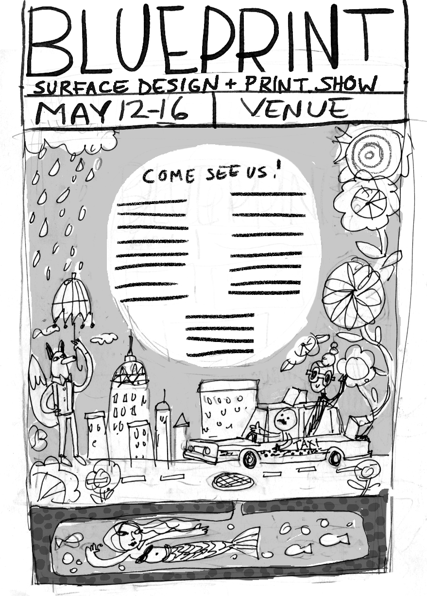

I have always had a soft spot for posters. In fact, a common assignment I would give to my pre-college students was to do a mock poster for a favorite musician or band. They’re just so much fun! I love the chance to combine my lettering and illustration into a piece, so this project was perfect for me. Luckily, the hand lettering contributed to the feeling Paul was going for- that handmade, raw kind of look that’s full of texture. He’s so on trend!
When designing a poster, it’s important to remember that the main function is all about communication. If the viewer can’t get the info they need almost instantly, it fails. When designing, I knew the exhibitor names and show information had to be clear and obvious. Of course, little Lauren Lowen just had to be ambitious and submit a really busy, colorful idea! But by making sure the lettering dominated first, I was able to have fun with everything else and it all came together. To help the message, I made sure to keep the Blueprint header design and color scheme it has had the last two shows. By keeping the same look and just doing a more hand done version, I kept the branding intact (I also kept the staggering blue and orange exhibitor names as a call back to previous posters). Since we wanted to hand letter the exhibitor names, I used Myriad Pro as my “skeleton” in Photoshop and hand drew on top. I got a completely original font out of it that fits the poster, but this step made sure that the names were somewhat consistent and easier to read.
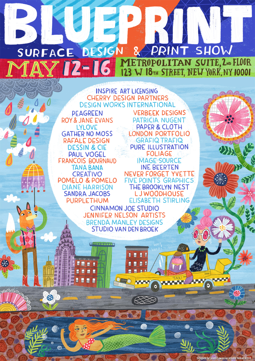
Here are 4 Fun facts about the poster you probably didn’t know!
- The 615 on the taxi is a shout out to Nashville’s area code. I am based right outside Music City (and yes, my husband is a musician. I can play classical kazoo, thank you).
- The mermaid was inspired by urban legends speculating what lurks underneath the streets of New York City. While most stories talk about huge abandoned pet alligators or radioactive rats, I decided it would be fun to have a more fantastical interpretation.
- Originally I wanted to draw Paul as the taxi driver, but I thought he might be shy about that idea. I have always loved Paul’s moustache, so the Walrus because a sort of avatar for him (the walrus is the moustache champ of the animal kingdom). I’m not saying Paul looks like a walrus, mind you. No. Also, this is a very handsome, classy Walrus. He’s well read and knows his fine wines (and drives a taxi, apparently).
- Paul and I have actually crossed paths before when I was an in-house designer at a large paper & gift company. It was always a good day when he would visit our art department!
I hope you have enjoyed reading about the process behind the Blueprint Show poster. Jennifer Nelson Artists will be there this May, so please say hello and schedule an appointment with us! - Lauren