Rae Ritchie for Generation Wild

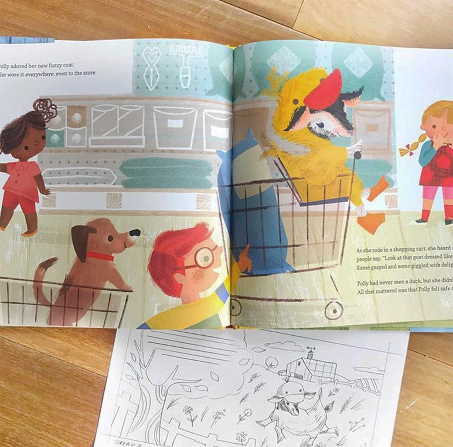
Towards the end of last year, I worked on an Instagram follower-lead social media campaign for an outdoor nonprofit in Colorado called Generation Wild. I worked with a team of writers and creatives to interpret an illustrated version of a previously created mascot named Wilder, a half goat, half Yeti who’s goal is to get children off the screens and get outside.

Wilder_book_ritchie-1.jpg

We then threw it out to the company’s followers to choose what Wilder did as he raced the sun on the winter solstice. This was definitely a quick turnaround “hot potato” project that was both challenging and incredibly fun. We even had an animator work with some of the illustrations to really bring it to life for the social media platforms. The style of this project, we decided to really play up Wilder’s beautiful coat with lots of texture and movement. Otherwise, I really tried to keep the compositions simple and focused, both for readability and for time-saving purposes.

raeritchie_2316_commission-post4c.jpg
raeritchie_2316_commission-post3b.jpg

You can check out the campaign on Instagram at @generationwildcolorado. A book version is now available as well! - Rae

raeritchie_2316_commission-post7a.jpg

Malin's Children's Book!

I am excited to share my illustrations for Johanna Olsson’s picture book One Child More or Less… What is the Difference Really?

I was so happy to illustrate this book with a fantastic little story about fear, friendship and imagination. I was given a lot of freedom and I also designed the cover, which I really enjoyed!

Framsida_Ett barn_bookcover_Gyllensvaan.jpg
19_20MAJ.jpg

Since this was my first children’s book, I must confess to maybe starting in the "wrong" end of things. I divided the text into different thumbnail images and started sketching and painting the images that I felt the most inspired by. That left the images I felt less inspired by, which were more difficult to get done! In hindsight I see the point with sketching up the whole book before starting to paint. But it all worked out in the end!

3.jpg

I made the backgrounds first and then I painted the characters separately so I could easily exchange them if I was not happy. That I would do again, I really enjoyed working like that.

2.jpg

I am so pleased with this little book, it was so fun to make. I became really fond of the little girl called "Virva"- I can relate to her since I also moved a lot as a child. Initially you never think you will get any friends but then like magic, you do.

1.jpg

One Child More or Less… What is the Difference Really? is available in Swedish, and may be ordered here.

5_6.jpg

Jill Howarth's Scholastic Book Project!

Over the past 5 years, I have had the honor to work with the great folks at Scholastic on a series of re-designed classics book covers for the Scholastic Reading Club. From Alice in Wonderland to Little Women (with 15 covers in between!) this entire series has been a joy to work on. Anytime you can combine lettering with characters, not to mention on a product that gets great affordable literature into young hands, is a win.

On all of these covers, the parameters were fairly open, other than the top consideration that it reduces to thumbnail size clearly with good contrast for optimum readability.

thumbnail_IMG_6229.jpg

Here are some initial pencils on the first title I worked on (and still one of my favorites) Alice in Wonderland. The book was to include a pocket watch pendant, so I incorporated the watch into the lettering in some of the sketches. Option 3 was chosen, with the caveat that Alice needed to be aged up. Simply lengthening her torso, cinching and lowering the waist and bingo, you have a tween Alice!

alice_thumbs_1.jpg
thumbnail_alice_thumbs_2.jpg

When going to color, I went with a dark background which ended itself to her mysterious decent into Wonderland as well as providing contrast and readability for the title. Favorite part? Angry flowers, of course!

thumbnail_JHOWARTH_alice_color_640.jpg

Rae Ritchie's Illustration for The Boston Globe

Hello there! I’m very excited and grateful to share a piece I was fortunate enough to work on for The Boston Globe! This lovely piece was written by Gail Thorell Schilling and is a touching account of her father’s lifelong love of gardening and the comfort it provided for him; and thus in his passing, the comfort his garden still brings the author. I was honored to work on this project and wanted to share a little bit of the process with you!

Rae-BostonGlobe_1.jpg

Upon reading the piece, I knew flowers and foliage would be the focus, so I felt right at home! I worked on a few thumbnail sketches, and the art director and I chose to further explore a landscape concept with a mighty spruce as the main focus. 

Scan 4.jpeg

I had a lot of fun creating this piece and helping bring Gail’s story to life. Check out the time-lapse video below to watch me paint it! Cheers!


Source: www.rae-ritchie.com

Making a Dream Project Come True: Birds in a Book by Rachel Grant

Just over a year ago a little dream of mine came true when I was asked by Abrams Noterie to illustrate not only a bird book, but a pop up bird book! Birds are one of my very favourite things to paint, I’ve always felt a certain connection with them, perhaps it’s something about their (comparatively) quiet, peaceful existence, where curiosity and nesting seem to be their primary goals! 

Bird book 9.JPG

When Abrams approached me to produce this book as part of their “Uplifting Editions” range, it was described as a “Bouquet of Birds” and I just loved this concept. The dust jacket comes off, revealing a hard cover reminiscent of antique bird books, then each branch and its bird lifts up above the book forming a bouquet shape that can then be displayed on a desk or a shelf. 

Bird book 6.JPG

My art director and editor began the design process with me by sharing a copy of a previous, floral version of the book that had been created in collaboration with Molly Hatch. This really helped me to see the way that I needed to engineer the illustrations in order to make them work within the confines of the page space. For example each pop up branch had to be carefully considered to check that its ‘turning circle’ was within the frame of the page when the book was closed and that the branch was wide enough to be sturdy and to take the rivet at its base. Then of course the overall ‘bouquet’ shape had to be considered, with the scale of the different bird species needing to be taken into account. 

Bird Book 11.JPG

With each spread I worked on came new facts about the birds. The text was written by Lesley Earle and I loved the way she brought the bird’s character to life, describing their quirky little habits and rituals. These kind of facts helped me to tell a little visual story on each page. For example, the male Regent Bowerbird builds an “impressive amphitheater” called a Bower to attract his prospective female and to provide them with a vantage point to watch his courtship display!

I created each page spread as a fully layered digital file in order to give maximum flexibility in the design process. To do this each element was painted individually with a mixture of acrylic, arcyla gouache and designer’s gouache on loose, watercolour paper. I then scanned these into the computer, removed the background white and digitally composed them onto the page. The text was added later by the lovely folks at Abrams. 

When my advance copy of the book arrived and I held it in my hands for the first time I was completely over the moon. To lift up each little bird and see the bouquet come to life, working just the way I designed it to, was the most rewarding thing in the world. After looking at it constantly for about a week, I then took great pleasure in taking it to my bookshelf and finding it a perfect spot amongst my collection of antique bird and botanical books. The completion of a dream come true. 

“Birds in a Book” can be purchased from Barnes&Noble, Books-A-Million, IndieBound, Powells, !ndigo and from Amazon worldwide. 

JNA goes to Lake Como, Italy for Artists Retreat 2018

If you follow us on social media, you know we’ve just gotten back from an artist retreat on Lake Como.  It was an amazing time!  We were generously hosted by Amore Escapes and the majestic GrandHotel Imperiale!  Our days were filled with painting, yoga, sight-seeing and, most importantly, time together.

0001_Grand Hotel Imperiale-29.jpg

JNA artists from around the the world gathered, Rae came from Minneapolis, Janna from Hamburg, Miriam from the Netherlands and our newest artist, Malin, from Stockholm.

We were in the town of Moltrasio perched right over a waterfall that pours into Lake Como. Below, you can see work-in-progress from the artists as well as some scenes from the village.

A highlight of the trip was a lake tour with our kind captain, Giacomo. The lake is lined with fabulous grand old (and a few new) homes. Some of which belong to George Clooney and Richard Branson… one property even boasts scenes from Star Wars and James Bond movies. This place is like a dream.

Below are a few more shots and more art. The work is as stunning as the place!

From left: Malin Gyllensvaan, Miriam Bos, Janna Krupinski and Rae Ritchie

From left: Malin Gyllensvaan, Miriam Bos, Janna Krupinski and Rae Ritchie

This is a trip I won’t ever forget! Stay tuned to see what we do next year! - Jennifer


Oodles of new products!

Whew, coming around the bend on another amazing spring of shows in NYC! I am just now catching my breath and have added some of our latest products to our portfolio. Take a minute to check out oodles of new JNA products today!

Screen Shot 2018-06-10 at 11.05.08 AM.png

What could be cuter than baby goats? Jill Howarth's adorable illustrations!

Hey! This past year I had the amazing opportunity to work on not one, not two, but three picture books with Quarto publishing about the sweet goats of Goats of Anarchy! If you are not familiar (which is likely NOT the case) GOA is a goat sanctuary in New Jersey, started by Leanne Lauricella, that takes in disabled goats. These little guys are as amazing as they are cute and their real-life stories were so fun to bring to life. Goats in coats, goats in duck costumes and a pig that acts as their nanny...what could be better? I actually had never really drawn a goat before, but I can't say that anymore! 

Proceeds from the sales of all the books go towards GOA's efforts to save these wonderful animals, making it both a fun and worthwhile project that I am honored to have taken part in. Recently, Leanne's story was a part of a piece on the popularity of goats on CBS Sunday Morning. Check it out! - Jill

Watch the entire video, if you have time... but if you are too eager, cut right to Goats of Anarchy and Jill's work, skip to minute 3:35. - Jennifer

GOA_covers.jpg
GOA_spreads.jpg
polly_cart_pic.jpg

Artsy Emojis by Bee Brown

Hi Everyone!

Earlier this year Jennifer contacted me with news of an interesting new project: Would I like to design some "Artsy Emojis" for a project being developed by the lovely Barbara Rucci and her design studio?

As a Graphic Designer by training I jumped at the chance. How cool! I've never had the opportunity to work on an App before and as a mum to two boys addicted to messaging on their iPhones and iPods, I was hoping to win a bit of credibility there too!

Barbara had a very clear idea of the kind of images she wanted to incorporate into her App so we rigged up a shared page on Pinterest where she could show me in quite specific detail the look she was after. This made my job much easier because I could see right from the outset the approach she desired: fun, quirky and colorful. I was excited to begin.

We started in the usual way with me responding to her list of subject matter with a series of simple black and white sketches. In total we worked on around 100 drawings for the App which we tackled in groups of 20 or so at a time. Once Barbara had approved these, the sketches went on to be made into vector shapes in Illustrator and then color was added. 

This is what Barbara has to say about the app and how it all came to be: "I started designing all of the emojis myself, but then realized I would never get this app done on my own. So I hired this crazy-talented illustrator named Bee Brown to draw about 100 of the emojis. I drew about 30 myself. Bee is really good at animals and faces, something that is not particularly my strength. I am very grateful to Bee for creating these drawings that are so whimsical and beguiling and F.U.N.! They are exactly what I was imagining."

"The emojis cover all types of categories, not just art supplies. There are flower and feather emojis, nature and beach emojis, food and dessert emojis, transportation and holiday emojis, and party emojis. They really are all so beautiful, I can’t wait for you to see them!"

Artsy Emoji's can now be downloaded from the Apple App Store
I hope you enjoy using them as much as we enjoyed creating them! - Bee

bee_blog_emoji_3.jpg
bee_blog_emoji_2.jpg
emoji_promo_1.jpg

Anisa's Mural for Mud Bay Pet Store

I was recently hired to do my first mural! My client was a local advertising agency who produced the mural for their client, a pet food shop. I’m sure this helped to make things go smoother, as the agency was able to act as a go-between for myself and the customer. Mud Bay is a beloved Northwest-based pet food company with a number of locations in Portland and Seattle. The brief that was given to me by the creative folks at the agency spoke of a "welcome to Northwest Portland" message. I'm proud to say the mural is one of the first things you’ll see as you get off the freeway and make your way into the quaint, charming neighborhood of Northwest Portland. The town is filled with Victorian and Craftsman houses, so we reflected that in the mural, and added lots of pets.

words.jpeg
village.jpeg
originaldrawing.jpg

This is my original artwork for the mural. There were a few revisions before it became a mural. The building owner wanted his own dog in there, so the gray dog was changed to cute dachshund.

finalartworksubmitted.jpg

Here’s the final mural. It's amazing they were able to do this! Though I’d be lying if I didn’t mention that there are a few changes and touch-ups I wish I could make. (That's the artist in me.) Also, it looks as if they stretched the drawing. Now I wish I could go in and add more flowers, they look a little bare.

mudbay.jpg

Overall it was a very exciting experience. It’s also super cool to see your art work so large like this! Hope you enjoy it too, Anisa

Lauren's My Super Sweet Scented Sketchbook for Klutz Books!

Wow, I'm so happy to show some interior pages of my new book out with Klutz, My Super Sweet Scented Sketchbook! 

laurenlowen_KLUTZ
laurenlowen_KLUTZ
Lauren Lowen's perfectly cute illustrations bring this terrific new KLUTZ book to life! The Super Sweet Scented Sketchbook (complete with scented markers)!
laurenlowen_KLUTZ
laurenlowen_KLUTZ

This was an absolute dream project and I couldn't be happier with how the finished product came out. Klutz was an AMAZING client to work with and their design team took my art to a whole new level! BONUS: it comes with scented markers that have faces and even EARS. How cute is that?  Enjoy! — Lauren

Miriam Bos's the Hidden Garden Collection for Birch Fabrics

I am so happy to announce that the Hidden Garden collection made with Birch Fabrics is finally open for orders.

Last year Birch Fabrics approached me to create a fabric collection inspired by ‘The Secret Garden’. A classic novel (1910) by Frances Hodgson Burnett. It’s a beautiful story about the friendship of a girl and two boys, who find a secret garden and work hard to make it bloom again. Of course, this is only a very modest summary.  I’d love to encourage you to read it some time, if you don’t know it yet.

I was listening to the book when I was working on this collection, and it literally got me in the mood. It’s been such a dream project to work on. I love working with Birch Fabrics. These are real kind people who put great effort and love in producing beautiful fabrics.

A few weeks ago Birch Fabrics attended the International Quilt Market in Houston. They shared a few photos on their Instagram account, and I loved seeing my artwork making it to actual products like onesies for baby’s, dresses, pillows, and curtains.

MiriamBos_BirchFabrics_1

Birch Fabrics also sent me a huge box of fabrics, and I really wanted to share some photos to give you an impression of their beautiful and intense colors and detail. I love the quality of their fabrics.

The fabrics are online available at Fabricworm.com and on the website of Birch Fabrics. Birch Fabrics also wrote a lovely blog about the collection!

Scroll through the gallery below for more imagery.

Enjoy - Miriam  

MiriamBos_BirchFabrics_2
MiriamBos_BirchFabrics_3
MiriamBos_BirchFabrics_4
MiriamBos_BirchFabrics_5
MiriamBos_BirchFabrics_6
MiriamBos_BirchFabrics_7
MiriamBos_BirchFabrics_8
MiriamBos_BirchFabrics_9
MiriamBos_BirchFabrics_10

Rae Ritchie’s Gift Guide Cover Design Work with the Los Angeles Times!

Happy holidays dear friends! I am over the moon excited to share a project I worked on for the Los Angeles Times last month! When Jennifer contacted me about a project with them, I was so excited, and I admit, a little nervous. When she said they wanted a cover design for their holiday gift guide AND an illustration for an article, I was pinching myself. I’ve always wanted to work with the Times, so this was really a dream come true! Here’s a look into my process for this exciting project.

In the idea stage, I stick to little thumbnails, just to flesh out the ideas in my head before I commit to an entire page. The client said they wanted to focus to be in hand lettering with some imagery that gets L.A. and Cali-handcrafted gifts across. 

When I decided on a basic layout that I liked, I proceeded to sketch it out for real! I then sent over to the LA Times team along with a color palette. They had a couple little tweaks as far as landmarks and placement. Once those changes were made, I was ready to proceed with the final art!

This is where the fun part begins; the painting! For this, I painted everything separately, then placed it together in Photoshop. This way, I have more flexibility in terms of layout and color tweaking, if needed.

It was a "star on top of the tree" moment when I added the Los Angles Times logo to the final art!

I followed a very similar process for the article illustration, beginning with a sketch, painting it up, then finessing in Photoshop!

Happy holidays everyone! Cheers <3 Rae

"Draw Every Day Draw Every Way" heART Journal Magazine review

The heART Journal Magazine, a print and digital magazine dedicated to mixed media techniques for art journals, mentioned Jennifer's Draw Every Day Draw Every Way in their Sept/Oct "Things We Like" column. 

Jennifer illustrates summer vacation for FLOW Magazine!

One of our favorite clients (and likely one of your favorite reads) is FLOW Magazine. Every assignment is so very clever and creative and their products are just THE best! Of course, we think they pick the very best artists too! Watch this charming little video to get an overview of FLOW's Vakantieboek (Vacation Book) 2016!

FLOW's Vakantieboek (Vacation Book) 2016  is out now! Jennifer's paper doll delights me and readers around the world as we slide in summer relaxation mode!

You can purchase the book here! Happy Swimming! - Jennifer

Lauren Lowen’s Blueprint Show Poster (And 4 Fun Facts About It!)

Hello! I am so happy to show the poster I designed for Blueprint’s third (yes, third!) show coming up this May 12-16 in New York City. Everyone at Jennifer Nelson Artists was honored to have one of us create it. Paul Turk, the show organizer and also awesome Big Cheese of Cinnamon Joe, gave me a lot of freedom. I designed two sketches which you can see here, and Paul selected the busy New York scene, which totally captures the energy of both the city and Blueprint.

I have always had a soft spot for posters. In fact, a common assignment I would give to my pre-college students was to do a mock poster for a favorite musician or band. They’re just so much fun! I love the chance to combine my lettering and illustration into a piece, so this project was perfect for me.  Luckily, the hand lettering contributed to the feeling Paul was going for- that handmade, raw kind of look that’s full of texture. He’s so on trend!

When designing a poster, it’s important to remember that the main function is all about communication. If the viewer can’t get the info they need almost instantly, it fails. When designing, I knew the exhibitor names and show information had to be clear and obvious. Of course, little Lauren Lowen just had to be ambitious and submit a really busy, colorful idea! But by making sure the lettering dominated first, I was able to have fun with everything else and it all came together. To help the message, I made sure to keep the Blueprint header design and color scheme it has had the last two shows. By keeping the same look and just doing a more hand done version, I kept the branding intact (I also kept the staggering blue and orange exhibitor names as a call back to previous posters). Since we wanted to hand letter the exhibitor names,  I used Myriad Pro as my “skeleton” in Photoshop and hand drew on top. I got a completely original font out of it that fits the poster, but this step made sure that the names were somewhat consistent and easier to read.

Here are 4 Fun facts about the poster you probably didn’t know!

  1. The 615 on the taxi is a shout out to Nashville’s area code. I am based right outside Music City (and yes, my husband is a musician. I can play classical kazoo, thank you).
  2. The mermaid was inspired by urban legends speculating what lurks underneath the streets of New York City. While most stories talk about huge abandoned pet alligators or radioactive rats, I decided it would be fun to have a more fantastical interpretation.
  3.  Originally I wanted to draw Paul as the taxi driver, but I thought he might be shy about that idea. I have always loved Paul’s moustache, so the Walrus because a sort of avatar for him (the walrus is the moustache champ of the animal kingdom). I’m not saying Paul looks like a walrus, mind you. No. Also, this is a very handsome, classy Walrus. He’s well read and knows his fine wines (and drives a taxi, apparently).
  4.  Paul and I have actually crossed paths before when I was an in-house designer at a large paper & gift company. It was always a good day when he would visit our art department!

I hope you have enjoyed reading about the process behind the Blueprint Show poster. Jennifer Nelson Artists will be there this May, so please say hello and schedule an appointment with us! - Lauren

Hello! My name is Anisa.

WEEK ONE: Flow Magazine has asked me to blog for them on Wednesdays all month.  We thought it would be fun to share these posts over here too! 

I was born in Lansing, Michigan, and I was a very creative child.  I was always interested in sewing or painting, or anything that involved colors. I studied printmaking at Minneapolis College of Art & Design.  

After college I just wanted to travel the U.S.  so I funded my trip by sewing hand made dresses, and selling them at music concerts, It was a great way to see my country.  It also started me into a business printing, sewing and later manufacturing my own clothing. 

I made clothes and sold under the label Makool for many years.  When I gave birth to my son 5 years ago, my love for travel and adventure won again and we decided to move from Portland, Oregon to Amsterdam, NL.  

Anisa at work.

Anisa at work.

While living in Amsterdam I fell in love with the canal houses and the bicycles and I began painting and drawing. I started taking classes in illustration, and before I knew it I had a new career.  

Last year we moved back from Amsterdam, to Portland.  Portland is on the West Coast of the U.S. right above California.  It's in a temperate rain forest.  It rains a lot here, but the rain makes it very green.  

The city is covered in moss, ferns, fog and old growth trees.  It feels good to live here, the city seems to glow green, it’s very healing.  I missed this living in Amsterdam. 

I’m excited to share my creative process as well as some of my inspiration over the next few weeks.  I hope you’ll visit my website and follow me on Instagram.

Enjoy! - Anisa

WEEK TWO: I thought today it would be nice if I gave you a tour of my new studio. Part of the incentive for me to move to Portland from Amsterdam was that I would have a new house. Our house was finished last June and we were able to move in after a long wait. My favorite room is my studio, it’s open with concrete floors and floor to ceiling windows facing the south. It’s a L shape so it’s hard to photograph, also on the day I took these picture we had some unexpected sunshine in Portland, it’s very rare.

You can see my cat “Happy Kids T.V.”, showing you the butterflies I did for this month’s issue of Flow. She’s a Devon Rex cat and she likes to come to my studio and find things she can attack. 

This is where I spend the majority of my time. I like to draw with pencils or calligraphy pens, and paint with gouache, ink, or acrylic. I mostly don’t keep sketch books unless I’m traveling. I prefer to make a bunch of drawings, and tape them to the wall. I work with my drawings in photoshop and I find that having them taped to the wall, lets me see everything I have without toggling through folders. 

Thanks for stopping by my studio. Next week I’m going to introduce you to some of my friends. - Anisa

WEEK THREE: 

This week I wanted to show you how I stay creative and social.  Having creative social outlets helps me to stay inspired, by thinking about making art in different ways. 

Portland is a very creative city, I feel fortunate to be a part of the art community.  Last year a group of women artists started an event called “Ladies Drawing Night”, it a private group,  when I was asked to join I was very excited.  The group meets once a month, we get together to sit around a table, drink wine, share snacks, and make art.  This has connected me with some amazingly talented local women, whom I admire, and it’s been a great resource.  Last month I brought my camera along to share a picture with you. 

(pictured here, from the right around the table is &nbsp;Lena Podesta,&nbsp;Adrienne Vita, Vera Brosgol,&nbsp;Peg Serena, Tara Lilly, Kinoko Evans, and the little blue person on pink paper is by Rilla Alexander)&nbsp;

(pictured here, from the right around the table is  Lena Podesta, Adrienne Vita, Vera Brosgol, Peg Serena, Tara Lilly, Kinoko Evans, and the little blue person on pink paper is by Rilla Alexander) 

Another project I do with friends is “Stamp Art Club”, once a month we each make a postage stamp based on a theme.  There are four of us, and we make these images to share on  Instagram.  We have a hashtag #stampartclub if you’d like to view the whole project. 

The artists are Tara Lilly from Portland, Oregon, Monika Forsberg from London, and Kate Mason from Australia.

One great thing about stamp art club is that it keeps me in touch with friends who live far away.   We are doing a project together so we can’t fall out of touch, also it insures that I have one playful assignment every month that’s just for myself.  So much of what you do as an illustrator is making work for clients, constantly thinking about what the client wants can get tiresome. 

I hope to encourage other creatives out there to begin some sort of “creative playground”, someplace where there’s no pressure just connecting with other artists in fun ways.  It can help to get you out of your own head, and the connections you'll make are priceless. - Anisa

WEEK 4: I used to think I couldn’t draw, but now I think drawing is like a muscle if you don’t use it’s not very strong and the more you use it the better it works.  

When I was in college, I always got C’s in drawing no matter how much energy I put into the class. This was discouraging for me and I only took the required amount of drawing to graduate art school.  I ended up studying photography and printmaking.  

After college I went on to teach myself how to sew and design patterns for clothing.  I did some screen printing on the clothing, but not very much.  I spent the next 10 years building up a business, selling hand made clothing designs.  Meanwhile I always felt something was missing.  I noticed myself spending time on the internet admiring the work of artists and illustrators. 

It was when I moved from Portland to Amsterdam that I stopped the clothing business it just wasn’t possible to move it.  I had a lot of time to be alone with my creativity which was really nagging me.  I felt lost not having a creative outlet.  One day when I was on Amazon shopping for books a suggestion caught my eye. It was Lilla Rogers “I just like to make things”, the title alone spoke to me and I ordered the book.  Shortly after, I began taking her classes, and things just snowballed from there.  Today I couldn’t imagine not drawing and painting every day, it feels like I’ve been doing this my whole life. 

Here’s a suggestion to get into drawing.  Give yourself an assignment.  I used to tell myself I’m just going to draw an object 50 times.  I discovered if you draw a chicken 50 times it’s not possible to have 50 bad drawings of a chicken a few of them will be interesting and pretty good. It’s a great way to get yourself into drawing and to discover your style. 

Thanks you for spending the month with me, I loved blogging every week.  - Anisa

The Portland Chimney Swifts

I recently got a really great commission and I wanted to share it with you. 

Portland hosts North Americas largest concentration of Vaux’s Swifts. Every September the birds nest in the chimney at Chapman Elementary School.  Vaux Swifts normally nest in hollowed out snags of old growth trees, but we have lost a lot of our old growth trees, and the largest population now nests in this chimney here in Portland.  In the 80’s when the birds began nesting in the chimney the school stopped using it’s heating system during the weeks of roosting.  Students and teachers wore sweaters and jackets until the end of September.  In 2003 the Audubon Society donated a new heating system to the school. Now the chimney is maintained sorely for the Swifts.  

You can imagine my excitement when I was approached to illustrate this beautiful scene.  The Swifts are a beloved Portland event, hundreds of folks gather every night in September to watch the show.  Enjoy - Anisa

Truck, Truck, Bus!

Tomorrow we will be hosting another great giveaway over on our Facebook page! Monika's amazing Truck + Bus game for eeBoo!

monika_forsberg

Pop on over to our contact page today to sign up for our mailing list! Contest begins tomorrow @ 10amEDT! Hope you win! - Jennifer

Pin to Win!

We are doing something a little different this week on the blog! We are celebrating our very first product out on the shelves with a giveaway! Enter for a chance to win Audrey Shulman's tasty book, Sitting in Bars with Cakes - beautifully illustrated by our very own, Jennifer Orkin Lewis. I am calling it "Pin to Win" - so do just that, add this image to your Pinterest and link back to us and I will randomly select a winner on April 21st!

You can have even more chances to win if you share this with others on your Facebook, Twitter and Instagram! The more I see, the happier I'll be! So, happy birthday to me - you CAN have your cake and eat it too! - Jennifer