Jill Howarth's Latest Book!

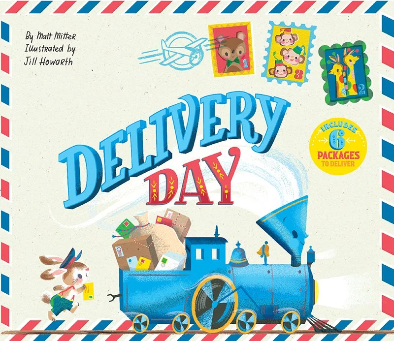
Chugga chugga! Chugga chugga! Choo! Choo! Make way for an awesome new Little Engine that Could book illustrated by Jill Howarth!

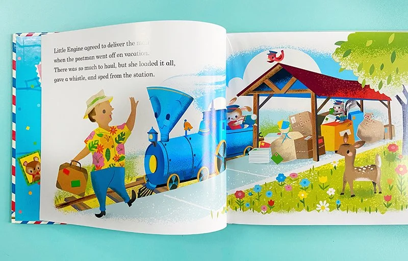
Published by Penguin Random House and written by Matt Mitter, this rhyming romp follows that sweet lil' engine as she covers for the vacationing postman; delivering packages to friends far and wide.

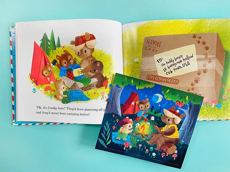
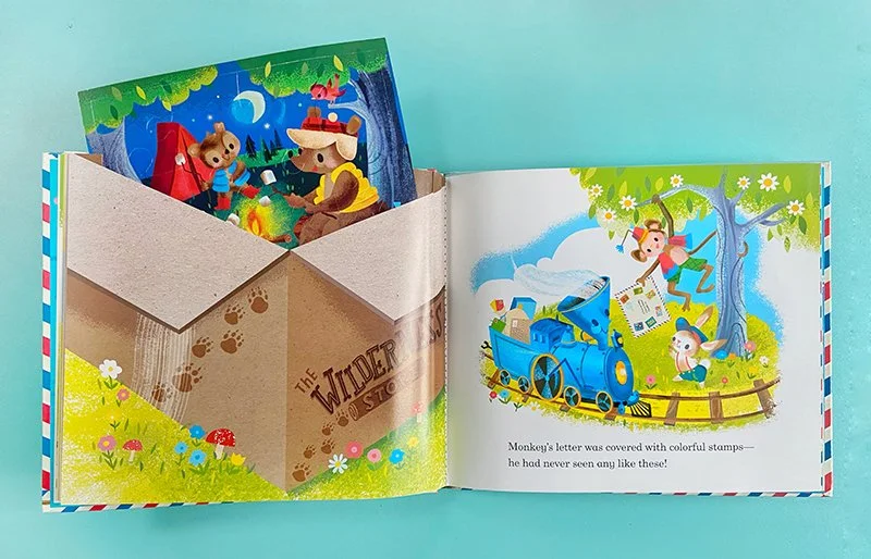
Even better? Delivery Day is full of surprises like real letters and envelopes from the story! Jill's gorgeous retro style perfectly captures the joy of the Little Engine that Could series. Well done, Jill!

If you are an art director for a publishing company, interested in working with Jill or any of our amazing artists, we'd love to hear from you! Let us know! In addition to being available for commissions, we have many book pitches to share from board books to adult how-to books.

Have a great week!

Kindly, Jennifer, Cathy + Haley

Dive into Anna Ivanir's world!

Oh, how I would love to live in the vibrant and inviting world that Anna Ivanir captures in her paintings! The palette, the beautiful and diverse people, the lush florals, and scrumptious foods, transport me to a joyful and wondrous place. Like all our artists, Anna is constantly creating new, gorgeous work available for art licensing or purchase! We are so proud to represent her at Jennifer Nelson Artists!!

Anna Ivanir

I would love to sit at one of Anna's tables! The vibrant colors in this trio are so inviting. Even with something as simple as food and hands, I feel transported into her painting.

Anna Ivanir

Just a little reminder that Mother's Day is May 8--which is coming up sooner than you think! This is such a sweet group of mothers with their kids.

Anna Ivanir

Trying to pick out one floral from all her fabulous botanicals was a challenge. I decided on this one because of her use of red, blue, yellow, and white in one flower! I love these intense, saturated brush strokes.

Anna Ivanir

This gorgeous group of ladies is one of Anna's specialties. She is so good at capturing the variety and beauty of all different kinds of people. I especially love this piece because it is bursting with details!

Anna Ivanir hard at work!

I bet you just love Anna's work as much as I do. Let us know if you would like to see even more!

New Repeats We Love! Part 3

And, for the final installment of some of our favorite patterns, we have some brilliant work by our artists ready to sell or license. This art would be perfect for bolt fabric, wrapping paper, children’s clothes, and more!

New Repeats We Love! Part 2

The part 2 you have all been waiting for! Here are more repeats for your enjoyment. I can’t pick a favorite, each and every one brings me joy. If there are any you can’t keep your eyes off we would love to know!

New Repeats We Love! Part 1

You'll want to see these repeats, repeatedly!

Friends!!! It has been such a long time since we've created a new blog post! I thought it would be extra special to make one all about patterns available for licensing! Realizing this silly oversight and how we have been repeatedly negligent over and over and over again to share repeats with you, I thought I'd break the cycle and post one now!

I adore each one of these pieces and heartily encourage you to scroll all the way down for some excellent, unique, and dazzling new work. From Christmas art to cursing cats to snakes and dragons, woodland creatures, suns, and more, you won't want to miss out! And, if you get a second, tell us your favorite!

Keep an eye out for Part 2 next week!

Malin's Mesmerizing eeBoo Puzzle!!

We just love to see our art on beautiful products. Malin’s new puzzle for eeBoo is among my favorites! I could get lost in its many details for hours- the mama bird protecting her nest, the little mouse with a mushroom for a chair, the sparkle in the rabbit’s eye… another astounding project from Malin!!

19062338_na_5287.jpeg
Screen Shot 2021-03-08 at 12.48.45 PM.png
Screen Shot 2021-03-08 at 12.49.23 PM.png
Screen Shot 2021-03-08 at 12.49.06 PM.png

Wishing you a happy and healthy holiday season, from all of us at JNA!

Here is a dazzling display of our newest holiday art available for licensing or sale!

Kelly Angelovic and Scholastic Want Kids to Rock the Vote!

Did your school ever have a mock vote for the next president? I remember ours did. It was Michael Dukakis versus George H. W. Bush. Nevermind who I voted for—let’s just say my candidate did not win at our school—the experience of voting, even at that age, was exciting and different. It’s been many, many years since those days but I will always remember this first toe-dip into good citizenship.

Now, if my school had a voting kit like this brain-child of our wonderful illustrator, Kelly Angelovic, I think it would have been that much more exciting! While Kelly was working on her fabulous female empowerment series, she realized she also wanted kids to feel empowered, too. What you see below is the result of hard work and support from Kelly and Scholastic, Inc.

scholastic_votekitentire_angelovic.jpg

Kelly’s amazing color pallet is eye-popping perfection! Plus, do you see those stickers in the back?? Such a great touch!!

The kit includes a book to teach children all about voting.  And, of course, it features Kelly’s wonderful hand-lettering!

The kit includes a book to teach children all about voting. And, of course, it features Kelly’s wonderful hand-lettering!

And here’s a little peak behind the scenes! These are Kelly’s concept sketches and one of the mock-ups used to design that sweet ballot box.

And here’s a little peak behind the scenes! These are Kelly’s concept sketches and one of the mock-ups used to design that sweet ballot box.

2_JuniorVotingKit_Final.jpg

Kelly says, “As a mom to two elementary-aged kids, creating something for our youngest citizens to teach them about voting and elections was deeply rewarding and FUN!! I'm thrilled with how it all turned out--the whole project was fantastic, from start to finish.”

We were so thrilled to be part of seeing this vision become reality. It was a beautiful, multifaceted project that has great meaning to us and, we hope, to your family and students, too! #votevotevote!

Christine's Ghostly Godiva Packaging!

I am so excited to share the process of working on my dream project for Godiva.

Having worked as an artist in Paris for many years, I remember there was a Godiva boutique right outside the Metro stop from where I worked. I would pass those deliciously stunning window displays each morning and peer in with awe at Godiva's gorgeously packaged products. Godiva's luxury chocolates were always beautifully designed with glossy packaging and sophisticated artwork.

Godiva_2.jpg

You can imagine the excitement I felt when they selected me to develop the artwork for their Halloween 2020 product line!

Having always been a huge fan of Halloween, cats and spooky themes, I was so thrilled to take on this commission. 

The client sent over a brief which I reviewed and then proceeded to have a meeting to further discuss any details that needed to be emphasized by the client.

They gave me their halloween seasonal Pantone colors to work with, as well as a very detailed description of what the feeling of the artwork should evoke. The client was very clear that they wanted the cats to be "not too childish or cute" but "not too frightening or scary either." 

This was a bit of a challenge for me since I like to draw cats with large silly eyes!

A spooky selection in the making—check out those Pantone colors!

A spooky selection in the making—check out those Pantone colors!

After several rounds of sketches and revisions, we settled on sophisticated black cats perched atop decorative embellished pumpkins. The client approved this sketch and then I developed two different design layouts with different color background options for the client to select. 

I created the artwork digitally using my Wacom Cintiq. The client requested minimal shading, they wanted the artwork to stand out and look very strong and bold without looking too simple or minimal. Though the rendering of the cats and pumpkins were minimal, I added in lots of little details that kept your eye moving throughout the design. The falling leaves, flying bats, and flickering candles all create a magical environment surrounding the cats in the pumpkin patch.

Cat_DieCut_CDC.jpg

The purple background was the winner! The client liked the layout/design of the purple background better, as well as the fact they felt the art popped out nicely from this color background.

 This collaboration is available in the US & Japan only. The Japanese release has a few more products and it's definitely worth checking out. The team did a fantastic job using die-cut shapes, embellishments and even glow in the dark features on the packaging.

 Even some of the chocolates have my artwork printed on them!

Yum!! The perfect mix of cute and creepy…

Yum!! The perfect mix of cute and creepy…

Glowing goodies!!

Glowing goodies!!

The Godiva team was a joy to collaborate with on such a special seasonal project. It was sincerely a dream come true to work with such an amazing client!

A Sweet Treat from Dylan and Seattle Chocolate

chugga-chugga chugga-chugga CHOCOLATE!! I am so excited to share this delicious collaboration between our own Dylan Mierzwinski and Seattle Chocolate. I love chocolate—milk chocolate, dark chocolate, white chocolate, chocolate with caramel, chocolate with mint, hazelnut butter crisp chocolate—and I love Dylan’s art—did you know she has almost 300 images in her archive?—so that makes this chocolate bar the happiest in the world.

SeattleChocolate-tukwila_hazelnut_bar_mierzwinski.jpg

Dylan’s artwork is lovely on this wrapper. The high-contrast lines make it bold and sophisticated, while the brilliant flowers pop with joy. It’s almost like I can see Dylan’s face hovering on the bar when I look at it. “You’ve got to try this hazelnut butter crisp,” she says, “You wouldn’t want to miss out on the happiest chocolate bar in the world, would you?” No need to hit me with #FOMO, Dylan. Of course I want to eat the happiest chocolate bar in the world!! And I want to frame that wrapper and hang it up, too!

Seriously, though, just look at it!

SeattleChocolate-tukwila_hazelnut_mierzwinski.jpg

Merrily Ever After with TAG

TAG and our artist, Janna Krupinski, have come up with the most adorable and jolly line of holiday homeware! Just look at these fabulous dishes!

TAG_winterholiday_G10452_krupinski.jpg

And adorable oh-so-Chrstimassy pillows!

These mugs are my absolute favorite to use during the Christmas season. I love the variety! You can have a set where no two cups match, yet they all go together.

Above all, one of my very favorite things is seeing how a drawing of Santa can turn into three dimensional items like mugs and pillows. Janna’s work is pure delight—and drinking from her art is a special treat!

Rachel Grant Taps Into Taproot

Taproot is a wonderful magazine, filled with crafts, recipes, plants, knitting projects, and more. It captures the same variety of homegrown joy that Rachel Grant’s work often captures. You see the work and feel a little more cozy. You realize that maybe the peace and love you’ve been looking for have been around you all along and, if they haven’t, it’s within your power to cultivate them. Both the magazine and Rachel’s art contain that special spark of inspiration.

So, when Taproot reached out, interested in Rachel’s work, it made such sense!

taproot_treasuremailbox_grant.jpg

This wonderful piece, commissioned by Taproot, looked beautiful next to the corresponding article about adopting a letter writing practice. Between these two works, I can safely say I’m going to do a little research into letter writing and see if I can make a new friend during this time of social distancing!

Miriam Bos for Berry Bros & Rudd Ltd

Last year, Miriam had the pleasure of working with the award-winning wine and spirits company, Berry Bros & Rudd Ltd. In addition to making art for their fantastic catalog, they used her work to decorate their Christmas-themed windows in London. Look how beautiful!

andrewsmcmeel_agenda_bos.JPG

And here’s a selection of her artwork in their beautiful catalog. The festive selection of wine pairs so perfectly with Miriam’s sweet holiday touches. Plus, I always love an appearance of her father Christmas. Simply magical.

Much like this fantastic work for Berry Bros + Rudd, Miriam is wonderful at creating whimsical art for any occassion or in any subject matter. We are so lucky to have her!

Heather's Rosemary Magazine Cover

This image was licensed from a personal project. I wanted to explore the splendor of the jewelry that would adorn a Mother Nature figure. I’m a huge fan of jewelry by Art Nouveau designer Rene Lalique and was inspired by his nature themes and the luminous quality captured in his colors.

As this piece neared completion I loved that the figure seemed to be glowing from within. I imagined her glow came from trusting her intuition and gathering strength from her inner peace. And like a moth to the flame, that inner peace attracts others to our goodness and joy. Which is why I was thrilled when Rosemary magazine licensed this piece for their homeschooling magazine, what a perfect message for parents trusting in their unique voice to educate their children.

download.png

My work is drawn digitally in Procreate. I start with a very rough sketch and refine as I add layers of color and textures to mimic traditional media.

www.heatherpowersart.com

Dylan and Fringe Delight!

Beautiful mugs, perfect planners, sweet notebooks.. Just look at this haul from Fringe! Dylan’s work suits each product perfectly. Any of these would be a excellent gift for the special people in your life—including YOU!

fringe_groupshoot1_dylan.jpg
fringe_minijournals_dylan copy.png

And who can believe these adorable pouches with matching fringe from Fringe?! Love the color coordination on these.

dylan_mierzwinski-fringepouch.jpg

Seeing Dylan’s beautiful work brought to life on these goodies has been such a thrill. Her unique color palette and gorgeous florals lend such charm to this unique line of products. We hope to work with Fringe again soon!

Rae Ritchie for Generation Wild

Towards the end of last year, I worked on an Instagram follower-lead social media campaign for an outdoor nonprofit in Colorado called Generation Wild. I worked with a team of writers and creatives to interpret an illustrated version of a previously created mascot named Wilder, a half goat, half Yeti who’s goal is to get children off the screens and get outside.

Wilder_book_ritchie-1.jpg

We then threw it out to the company’s followers to choose what Wilder did as he raced the sun on the winter solstice. This was definitely a quick turnaround “hot potato” project that was both challenging and incredibly fun. We even had an animator work with some of the illustrations to really bring it to life for the social media platforms. The style of this project, we decided to really play up Wilder’s beautiful coat with lots of texture and movement. Otherwise, I really tried to keep the compositions simple and focused, both for readability and for time-saving purposes.

raeritchie_2316_commission-post4c.jpg
raeritchie_2316_commission-post3b.jpg

You can check out the campaign on Instagram at @generationwildcolorado. A book version is now available as well! - Rae

raeritchie_2316_commission-post7a.jpg

Malin's Children's Book!

I am excited to share my illustrations for Johanna Olsson’s picture book One Child More or Less… What is the Difference Really?

I was so happy to illustrate this book with a fantastic little story about fear, friendship and imagination. I was given a lot of freedom and I also designed the cover, which I really enjoyed!

Framsida_Ett barn_bookcover_Gyllensvaan.jpg
19_20MAJ.jpg

Since this was my first children’s book, I must confess to maybe starting in the "wrong" end of things. I divided the text into different thumbnail images and started sketching and painting the images that I felt the most inspired by. That left the images I felt less inspired by, which were more difficult to get done! In hindsight I see the point with sketching up the whole book before starting to paint. But it all worked out in the end!

3.jpg

I made the backgrounds first and then I painted the characters separately so I could easily exchange them if I was not happy. That I would do again, I really enjoyed working like that.

2.jpg

I am so pleased with this little book, it was so fun to make. I became really fond of the little girl called "Virva"- I can relate to her since I also moved a lot as a child. Initially you never think you will get any friends but then like magic, you do.

1.jpg

One Child More or Less… What is the Difference Really? is available in Swedish, and may be ordered here.

5_6.jpg

Kelly Angelovic's Marvelous Mural!

A few weeks ago, a client and friend of mine (Todd Walsh, owner of Market Real Estate here in Boulder, CO) reached out, wanting to do something big to uplift and unite our community.

KellyAngelovic_1.JPG

Todd sent over pictures of the wall he wanted covered with my artwork, and together we decided on the phrase, We Are All In This Together. 

I sent him the following two sketches. The first idea was purely type driven. The second sketch was more conceptual, with several different buildings/houses and a banner winding around the buildings, sharing our message of togetherness even though we are apart. 

KellyAngelovic_InThisTogether_TypeSketch.jpg
KellyAngelovic_InThisTogether_BannerSketch.jpg

Todd gave me the freedom to follow my own artistic vision (best client ever), and here is the end result.

KellyAngelovic_InThisTogether_FinalFileLO.jpg

Using a vibrant color palette (to uplift and inspire hope), I wanted to include several people doing what we're all doing while staying home (reading, online learning, comforting one another through our collective uncertainty). The plants represent our growth, and the butterflies our evolution. My favorite part is the children literally climbing the walls as they play (as the mother of two elementary school aged children, I can really relate to this one). 

 Here are a few shots of the installation process as well.

KellyAngelovic_4.JPG
KellyAngelovic_5.JPG

This was one of the most meaningful and exciting projects I have ever had the opportunity to work on. Thank you so much to Todd and Market Real Estate for having the overall vision to make this happen. We truly are all in this together. 


KellyAngelovic_6.JPG