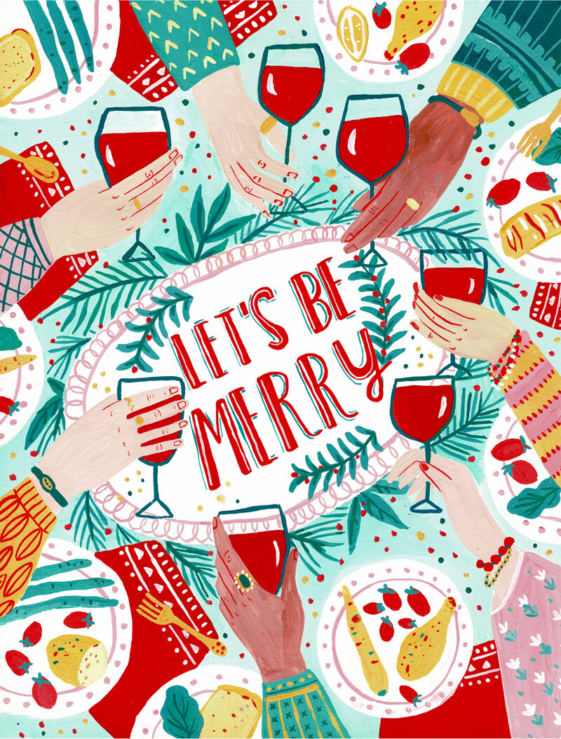
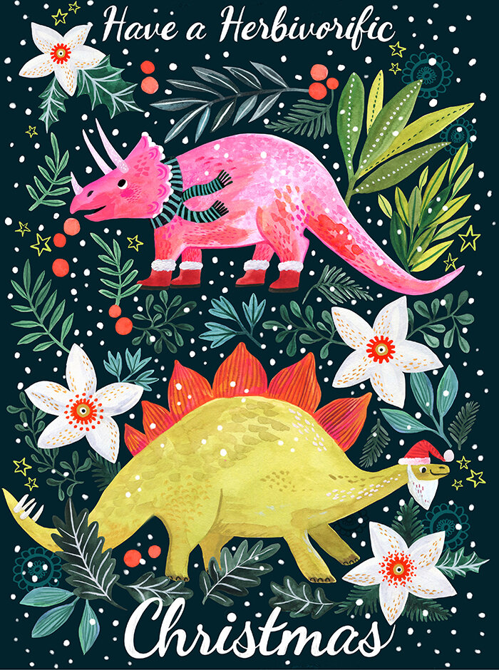
And, for the final installment of some of our favorite patterns, we have some brilliant work by our artists ready to sell or license. This art would be perfect for bolt fabric, wrapping paper, children’s clothes, and more!


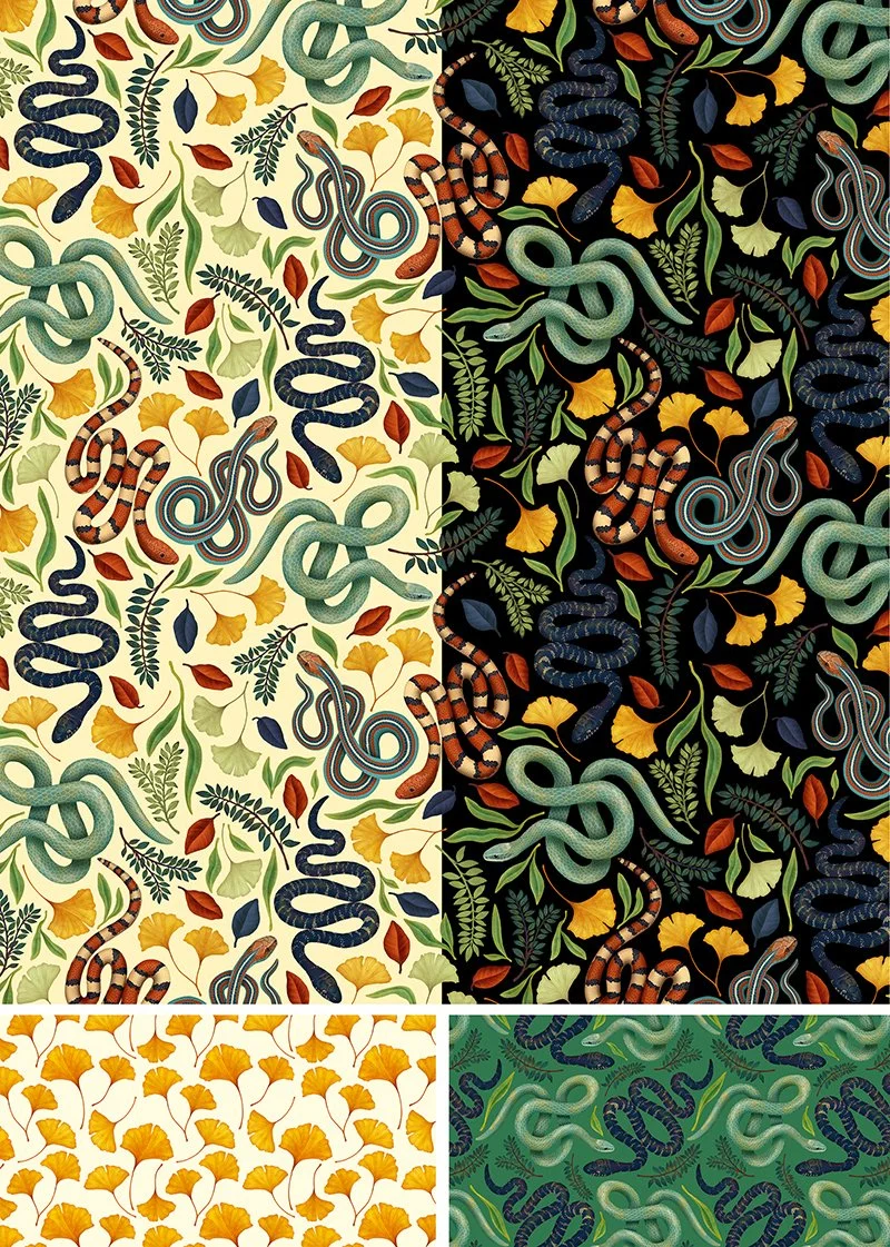
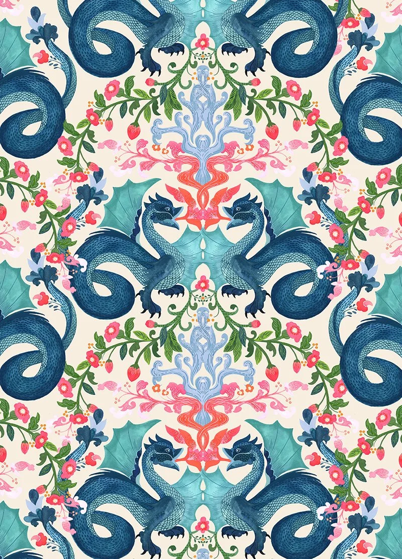
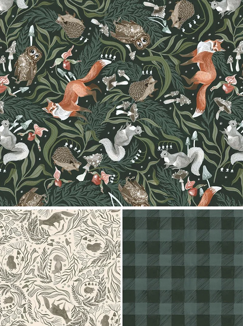
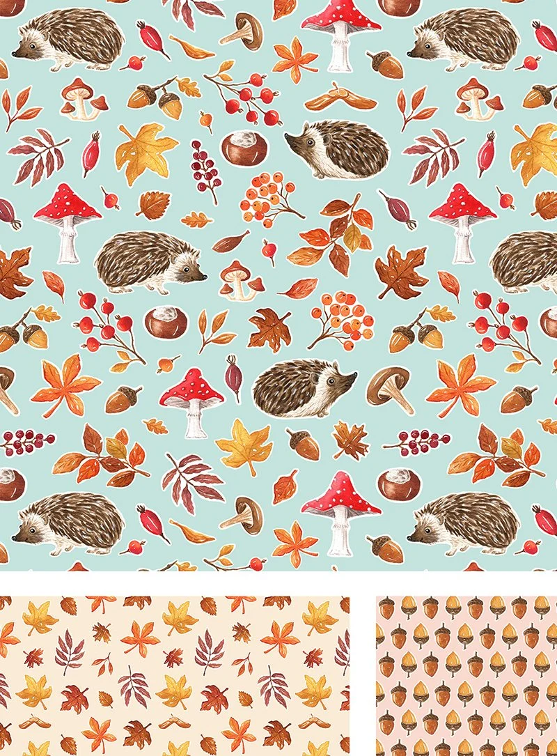
New Repeats We Love! Part 2
The part 2 you have all been waiting for! Here are more repeats for your enjoyment. I can’t pick a favorite, each and every one brings me joy. If there are any you can’t keep your eyes off we would love to know!

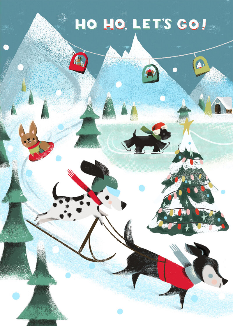
New Repeats We Love! Part 1
You'll want to see these repeats, repeatedly!
Friends!!! It has been such a long time since we've created a new blog post! I thought it would be extra special to make one all about patterns available for licensing! Realizing this silly oversight and how we have been repeatedly negligent over and over and over again to share repeats with you, I thought I'd break the cycle and post one now!
I adore each one of these pieces and heartily encourage you to scroll all the way down for some excellent, unique, and dazzling new work. From Christmas art to cursing cats to snakes and dragons, woodland creatures, suns, and more, you won't want to miss out! And, if you get a second, tell us your favorite!
Keep an eye out for Part 2 next week!

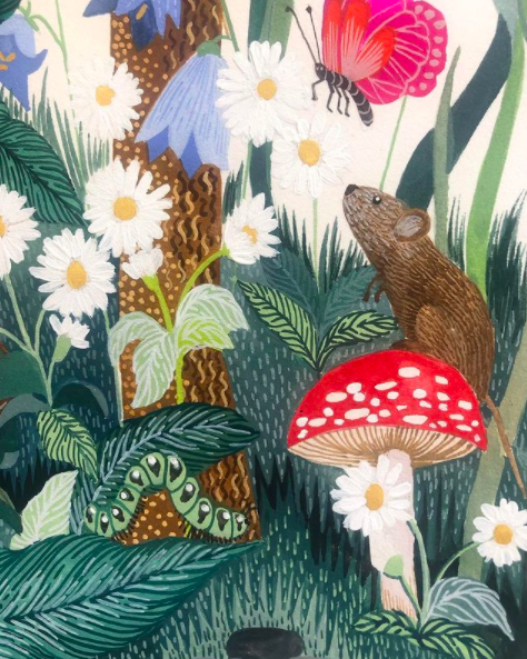
Malin's Mesmerizing eeBoo Puzzle!!
We just love to see our art on beautiful products. Malin’s new puzzle for eeBoo is among my favorites! I could get lost in its many details for hours- the mama bird protecting her nest, the little mouse with a mushroom for a chair, the sparkle in the rabbit’s eye… another astounding project from Malin!!


Wishing you a happy and healthy holiday season, from all of us at JNA!
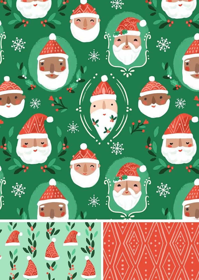
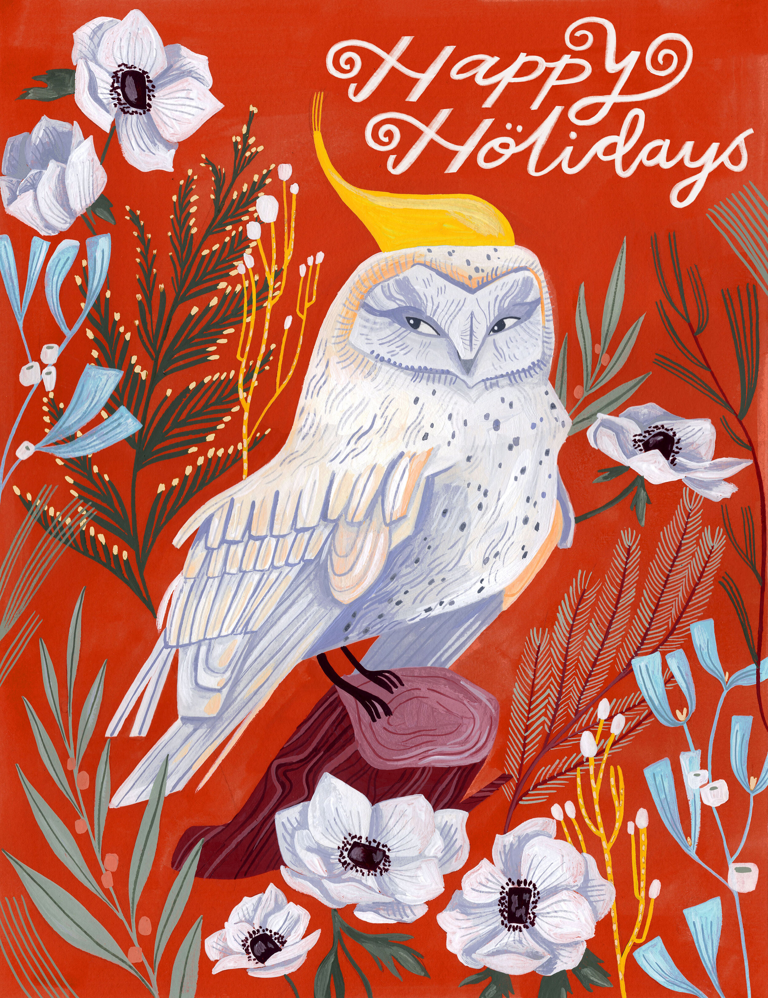
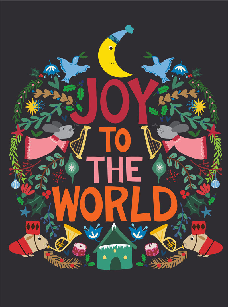
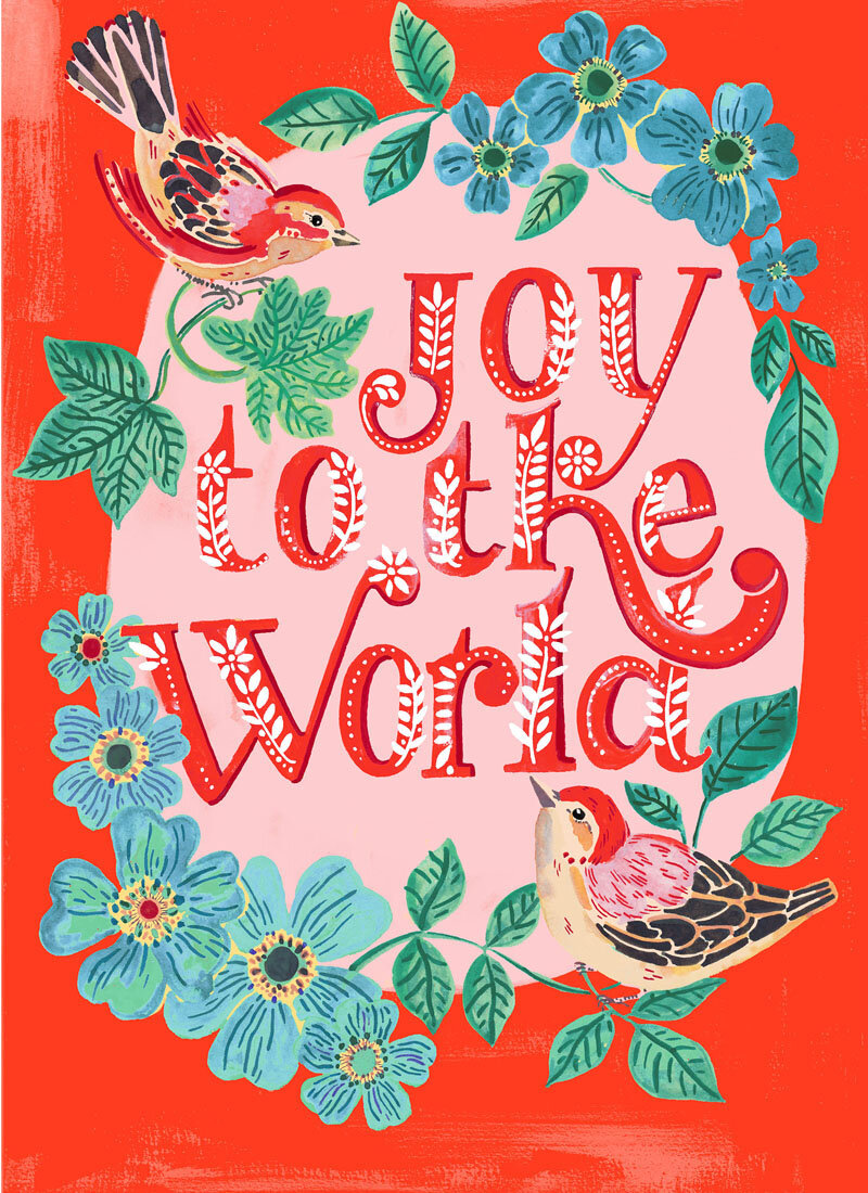
Here is a dazzling display of our newest holiday art available for licensing or sale!
Kelly Angelovic and Scholastic Want Kids to Rock the Vote!
Did your school ever have a mock vote for the next president? I remember ours did. It was Michael Dukakis versus George H. W. Bush. Nevermind who I voted for—let’s just say my candidate did not win at our school—the experience of voting, even at that age, was exciting and different. It’s been many, many years since those days but I will always remember this first toe-dip into good citizenship.
Now, if my school had a voting kit like this brain-child of our wonderful illustrator, Kelly Angelovic, I think it would have been that much more exciting! While Kelly was working on her fabulous female empowerment series, she realized she also wanted kids to feel empowered, too. What you see below is the result of hard work and support from Kelly and Scholastic, Inc.

Kelly’s amazing color pallet is eye-popping perfection! Plus, do you see those stickers in the back?? Such a great touch!!

The kit includes a book to teach children all about voting. And, of course, it features Kelly’s wonderful hand-lettering!
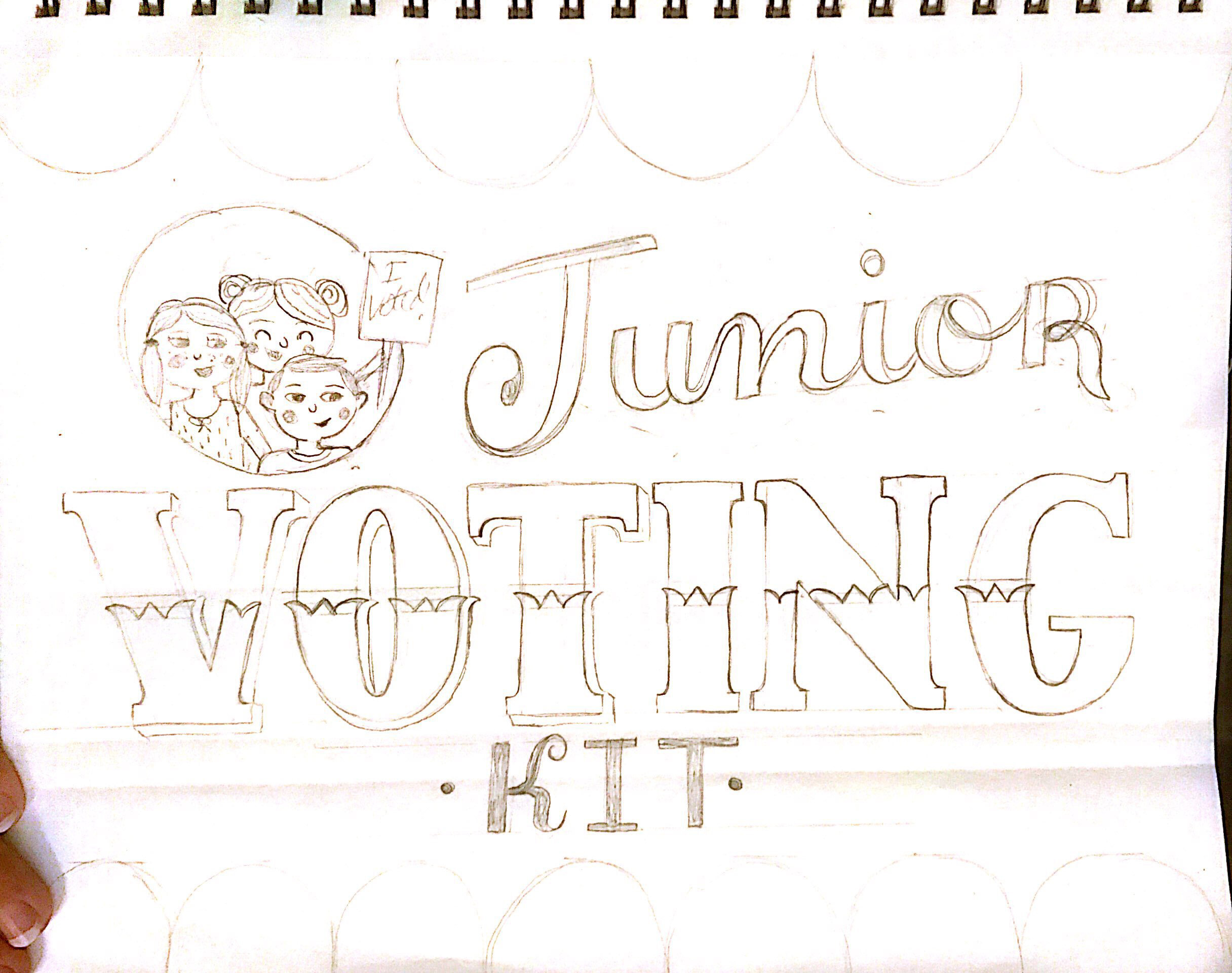
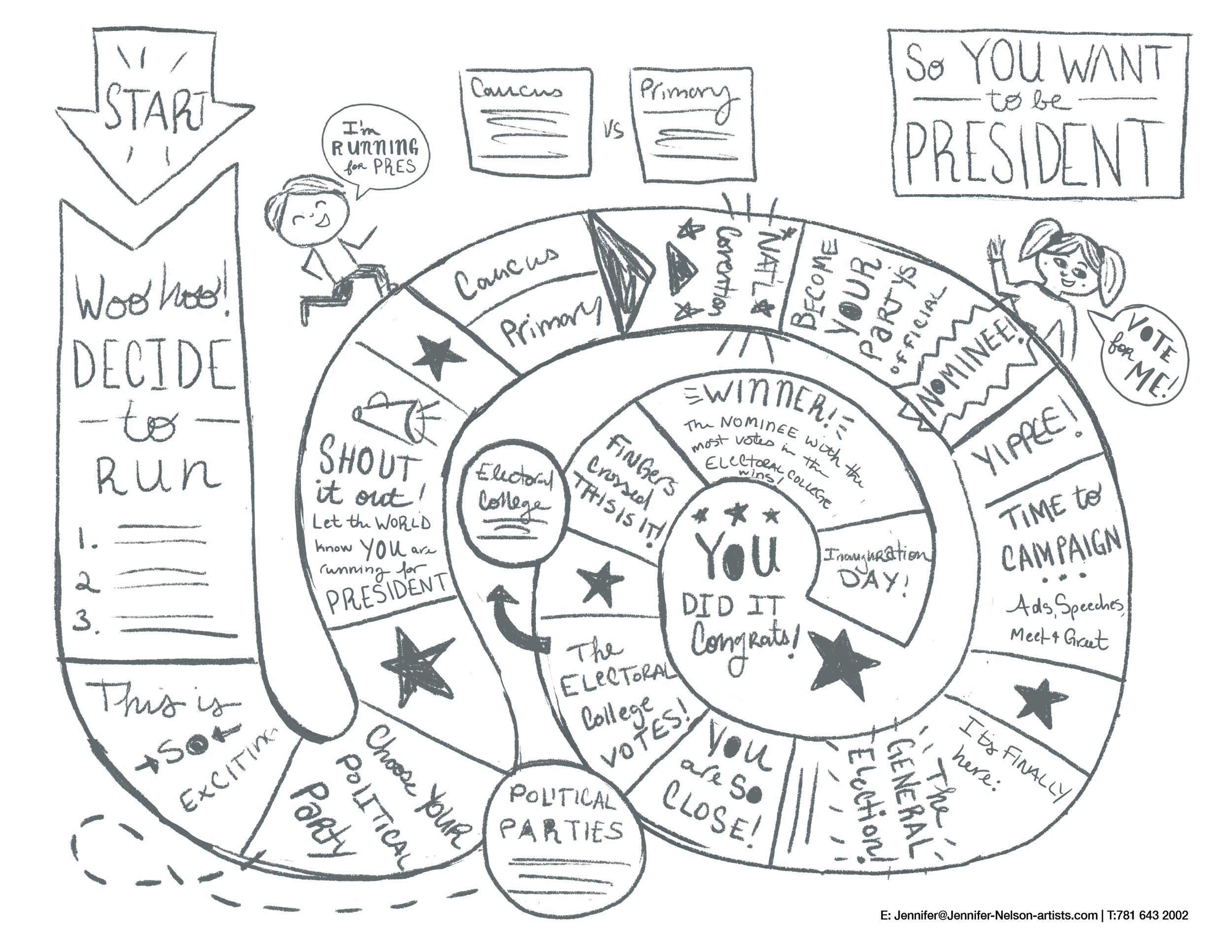

And here’s a little peak behind the scenes! These are Kelly’s concept sketches and one of the mock-ups used to design that sweet ballot box.

Kelly says, “As a mom to two elementary-aged kids, creating something for our youngest citizens to teach them about voting and elections was deeply rewarding and FUN!! I'm thrilled with how it all turned out--the whole project was fantastic, from start to finish.”
We were so thrilled to be part of seeing this vision become reality. It was a beautiful, multifaceted project that has great meaning to us and, we hope, to your family and students, too! #votevotevote!
Christine's Ghostly Godiva Packaging!
I am so excited to share the process of working on my dream project for Godiva.
Having worked as an artist in Paris for many years, I remember there was a Godiva boutique right outside the Metro stop from where I worked. I would pass those deliciously stunning window displays each morning and peer in with awe at Godiva's gorgeously packaged products. Godiva's luxury chocolates were always beautifully designed with glossy packaging and sophisticated artwork.

You can imagine the excitement I felt when they selected me to develop the artwork for their Halloween 2020 product line!
Having always been a huge fan of Halloween, cats and spooky themes, I was so thrilled to take on this commission.
The client sent over a brief which I reviewed and then proceeded to have a meeting to further discuss any details that needed to be emphasized by the client.
They gave me their halloween seasonal Pantone colors to work with, as well as a very detailed description of what the feeling of the artwork should evoke. The client was very clear that they wanted the cats to be "not too childish or cute" but "not too frightening or scary either."
This was a bit of a challenge for me since I like to draw cats with large silly eyes!
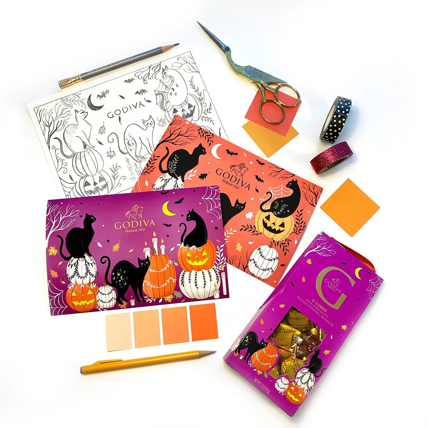
A spooky selection in the making—check out those Pantone colors!
After several rounds of sketches and revisions, we settled on sophisticated black cats perched atop decorative embellished pumpkins. The client approved this sketch and then I developed two different design layouts with different color background options for the client to select.
I created the artwork digitally using my Wacom Cintiq. The client requested minimal shading, they wanted the artwork to stand out and look very strong and bold without looking too simple or minimal. Though the rendering of the cats and pumpkins were minimal, I added in lots of little details that kept your eye moving throughout the design. The falling leaves, flying bats, and flickering candles all create a magical environment surrounding the cats in the pumpkin patch.

The purple background was the winner! The client liked the layout/design of the purple background better, as well as the fact they felt the art popped out nicely from this color background.
This collaboration is available in the US & Japan only. The Japanese release has a few more products and it's definitely worth checking out. The team did a fantastic job using die-cut shapes, embellishments and even glow in the dark features on the packaging.
Even some of the chocolates have my artwork printed on them!

Yum!! The perfect mix of cute and creepy…

Glowing goodies!!
The Godiva team was a joy to collaborate with on such a special seasonal project. It was sincerely a dream come true to work with such an amazing client!
A Sweet Treat from Dylan and Seattle Chocolate
chugga-chugga chugga-chugga CHOCOLATE!! I am so excited to share this delicious collaboration between our own Dylan Mierzwinski and Seattle Chocolate. I love chocolate—milk chocolate, dark chocolate, white chocolate, chocolate with caramel, chocolate with mint, hazelnut butter crisp chocolate—and I love Dylan’s art—did you know she has almost 300 images in her archive?—so that makes this chocolate bar the happiest in the world.

Dylan’s artwork is lovely on this wrapper. The high-contrast lines make it bold and sophisticated, while the brilliant flowers pop with joy. It’s almost like I can see Dylan’s face hovering on the bar when I look at it. “You’ve got to try this hazelnut butter crisp,” she says, “You wouldn’t want to miss out on the happiest chocolate bar in the world, would you?” No need to hit me with #FOMO, Dylan. Of course I want to eat the happiest chocolate bar in the world!! And I want to frame that wrapper and hang it up, too!
Seriously, though, just look at it!

Merrily Ever After with TAG
TAG and our artist, Janna Krupinski, have come up with the most adorable and jolly line of holiday homeware! Just look at these fabulous dishes!

And adorable oh-so-Chrstimassy pillows!
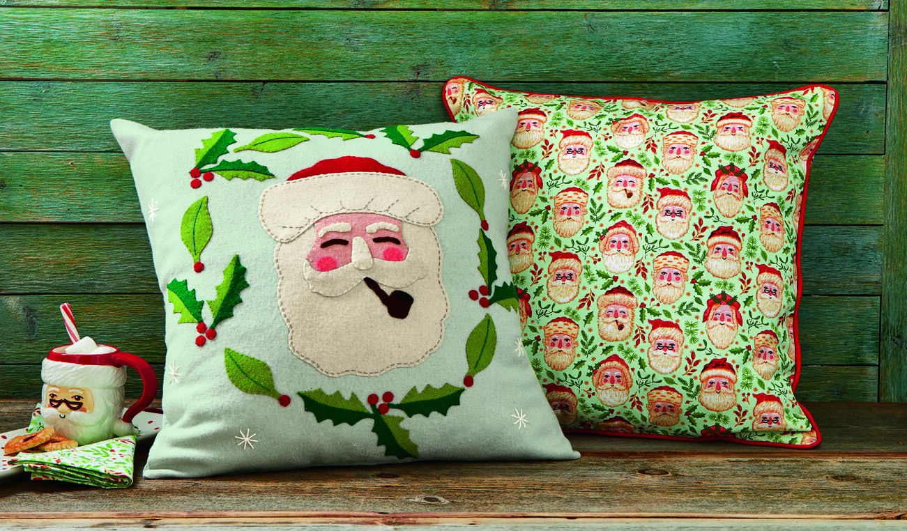
These mugs are my absolute favorite to use during the Christmas season. I love the variety! You can have a set where no two cups match, yet they all go together.
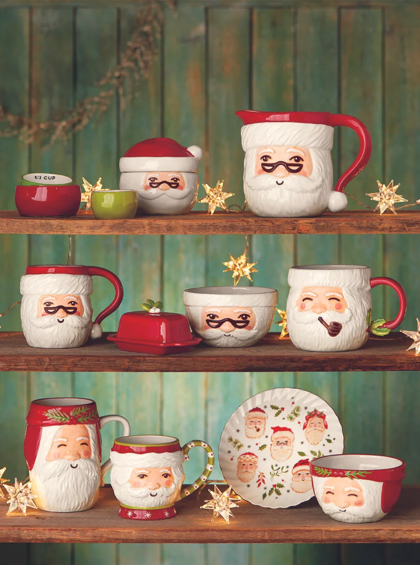
Above all, one of my very favorite things is seeing how a drawing of Santa can turn into three dimensional items like mugs and pillows. Janna’s work is pure delight—and drinking from her art is a special treat!
Rachel Grant Taps Into Taproot
Taproot is a wonderful magazine, filled with crafts, recipes, plants, knitting projects, and more. It captures the same variety of homegrown joy that Rachel Grant’s work often captures. You see the work and feel a little more cozy. You realize that maybe the peace and love you’ve been looking for have been around you all along and, if they haven’t, it’s within your power to cultivate them. Both the magazine and Rachel’s art contain that special spark of inspiration.
So, when Taproot reached out, interested in Rachel’s work, it made such sense!

This wonderful piece, commissioned by Taproot, looked beautiful next to the corresponding article about adopting a letter writing practice. Between these two works, I can safely say I’m going to do a little research into letter writing and see if I can make a new friend during this time of social distancing!
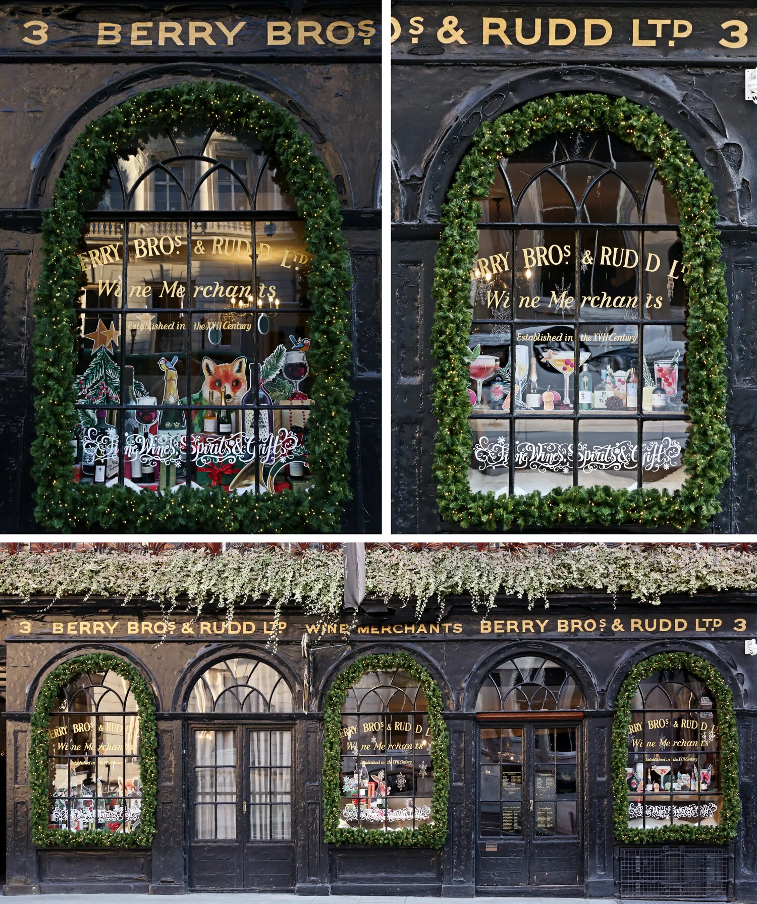
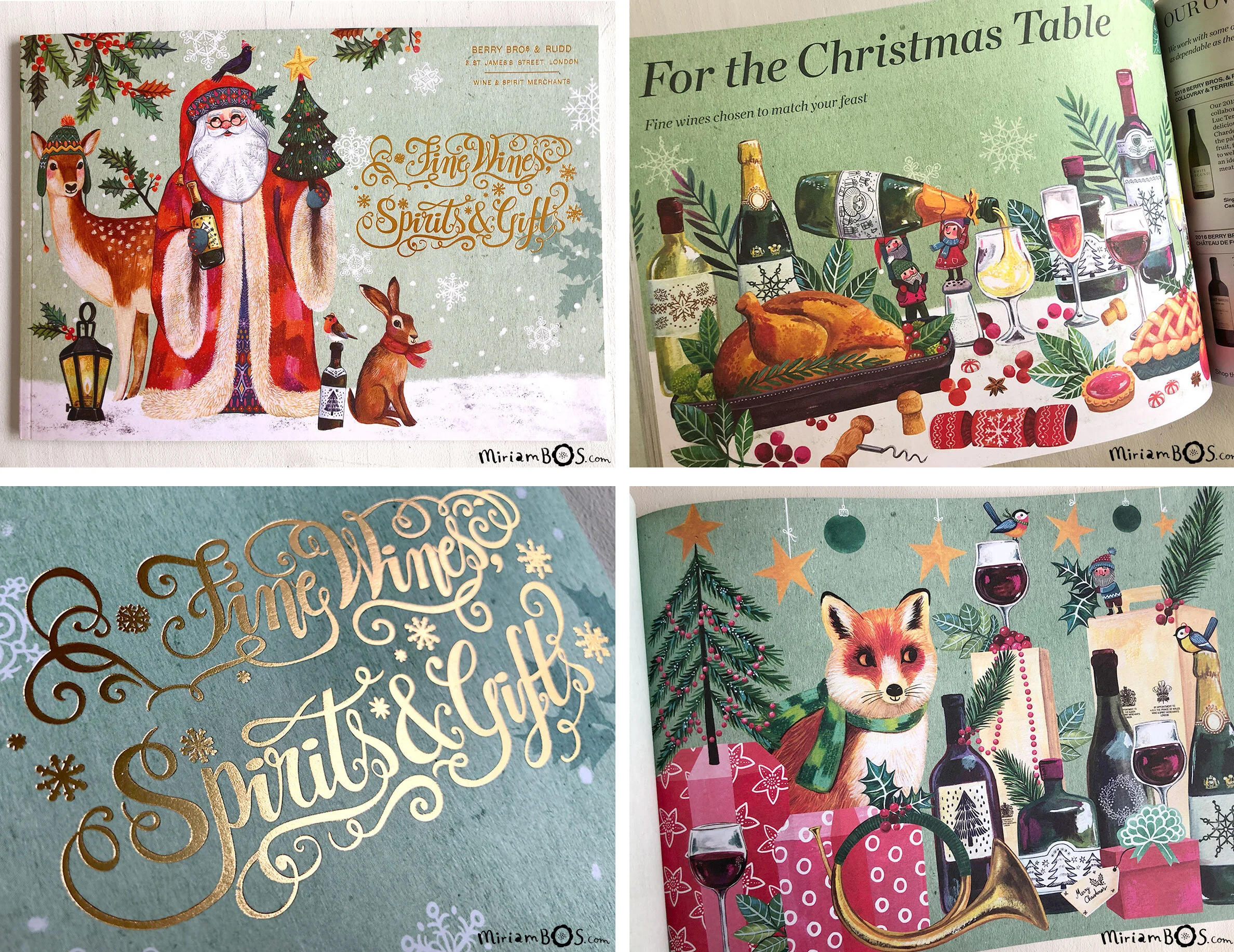
Miriam Bos for Berry Bros & Rudd Ltd
Last year, Miriam had the pleasure of working with the award-winning wine and spirits company, Berry Bros & Rudd Ltd. In addition to making art for their fantastic catalog, they used her work to decorate their Christmas-themed windows in London. Look how beautiful!
And here’s a selection of her artwork in their beautiful catalog. The festive selection of wine pairs so perfectly with Miriam’s sweet holiday touches. Plus, I always love an appearance of her father Christmas. Simply magical.
Much like this fantastic work for Berry Bros + Rudd, Miriam is wonderful at creating whimsical art for any occassion or in any subject matter. We are so lucky to have her!

Illustrating Dolly Parton's America
Christine De Carvalho loves Dolly Parton. So, when New York Public Radio contacted us, interested in commissioning Christine for an upcoming Dolly Parton Podcast, we were over the moon! When the agency gets to share big news like that with an artist, it is a great day—and this one made for a great week!
Christine worked with WNYC to create not only the gorgeous Dolly Parton’s America cover but also art for each of the seven episodes. The end result was fabulous! It always amazes me how collaboration can lead to wonderful work. Oftentimes, it can challenge an artist to try new things or explore areas they never considered before.
When the podcast came out, we were beyond thrilled to share with the rest of the world this amazing project. Plus, the podcast is one of the best I’ve ever heard! In fact, the New Yorker declared it the best podcast of 2019. But don’t take our word for it! If you haven’t had a listen, you can check out the podcast here.
I’m pleased to share that Christine just recently finished another dream project and is available for commissions, as are all of our fabulous artists. Whether you’re looking for art for that Elvis Costello podcast you’ve been working on or you have a greeting card you’d like to be “just so.”
Heather's Rosemary Magazine Cover
This image was licensed from a personal project. I wanted to explore the splendor of the jewelry that would adorn a Mother Nature figure. I’m a huge fan of jewelry by Art Nouveau designer Rene Lalique and was inspired by his nature themes and the luminous quality captured in his colors.

As this piece neared completion I loved that the figure seemed to be glowing from within. I imagined her glow came from trusting her intuition and gathering strength from her inner peace. And like a moth to the flame, that inner peace attracts others to our goodness and joy. Which is why I was thrilled when Rosemary magazine licensed this piece for their homeschooling magazine, what a perfect message for parents trusting in their unique voice to educate their children.

My work is drawn digitally in Procreate. I start with a very rough sketch and refine as I add layers of color and textures to mimic traditional media.
www.heatherpowersart.com
Dylan and Fringe Delight!
Beautiful mugs, perfect planners, sweet notebooks.. Just look at this haul from Fringe! Dylan’s work suits each product perfectly. Any of these would be a excellent gift for the special people in your life—including YOU!

And who can believe these adorable pouches with matching fringe from Fringe?! Love the color coordination on these.

Seeing Dylan’s beautiful work brought to life on these goodies has been such a thrill. Her unique color palette and gorgeous florals lend such charm to this unique line of products. We hope to work with Fringe again soon!
Rae Ritchie for Generation Wild
Towards the end of last year, I worked on an Instagram follower-lead social media campaign for an outdoor nonprofit in Colorado called Generation Wild. I worked with a team of writers and creatives to interpret an illustrated version of a previously created mascot named Wilder, a half goat, half Yeti who’s goal is to get children off the screens and get outside.

We then threw it out to the company’s followers to choose what Wilder did as he raced the sun on the winter solstice. This was definitely a quick turnaround “hot potato” project that was both challenging and incredibly fun. We even had an animator work with some of the illustrations to really bring it to life for the social media platforms. The style of this project, we decided to really play up Wilder’s beautiful coat with lots of texture and movement. Otherwise, I really tried to keep the compositions simple and focused, both for readability and for time-saving purposes.


You can check out the campaign on Instagram at @generationwildcolorado. A book version is now available as well! - Rae

Malin's Children's Book!
I am excited to share my illustrations for Johanna Olsson’s picture book One Child More or Less… What is the Difference Really?
I was so happy to illustrate this book with a fantastic little story about fear, friendship and imagination. I was given a lot of freedom and I also designed the cover, which I really enjoyed!


Since this was my first children’s book, I must confess to maybe starting in the "wrong" end of things. I divided the text into different thumbnail images and started sketching and painting the images that I felt the most inspired by. That left the images I felt less inspired by, which were more difficult to get done! In hindsight I see the point with sketching up the whole book before starting to paint. But it all worked out in the end!

I made the backgrounds first and then I painted the characters separately so I could easily exchange them if I was not happy. That I would do again, I really enjoyed working like that.

I am so pleased with this little book, it was so fun to make. I became really fond of the little girl called "Virva"- I can relate to her since I also moved a lot as a child. Initially you never think you will get any friends but then like magic, you do.
One Child More or Less… What is the Difference Really? is available in Swedish, and may be ordered here.

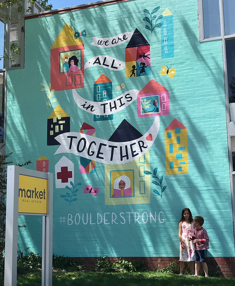
Kelly Angelovic's Marvelous Mural!
A few weeks ago, a client and friend of mine (Todd Walsh, owner of Market Real Estate here in Boulder, CO) reached out, wanting to do something big to uplift and unite our community.

Todd sent over pictures of the wall he wanted covered with my artwork, and together we decided on the phrase, We Are All In This Together.
I sent him the following two sketches. The first idea was purely type driven. The second sketch was more conceptual, with several different buildings/houses and a banner winding around the buildings, sharing our message of togetherness even though we are apart.
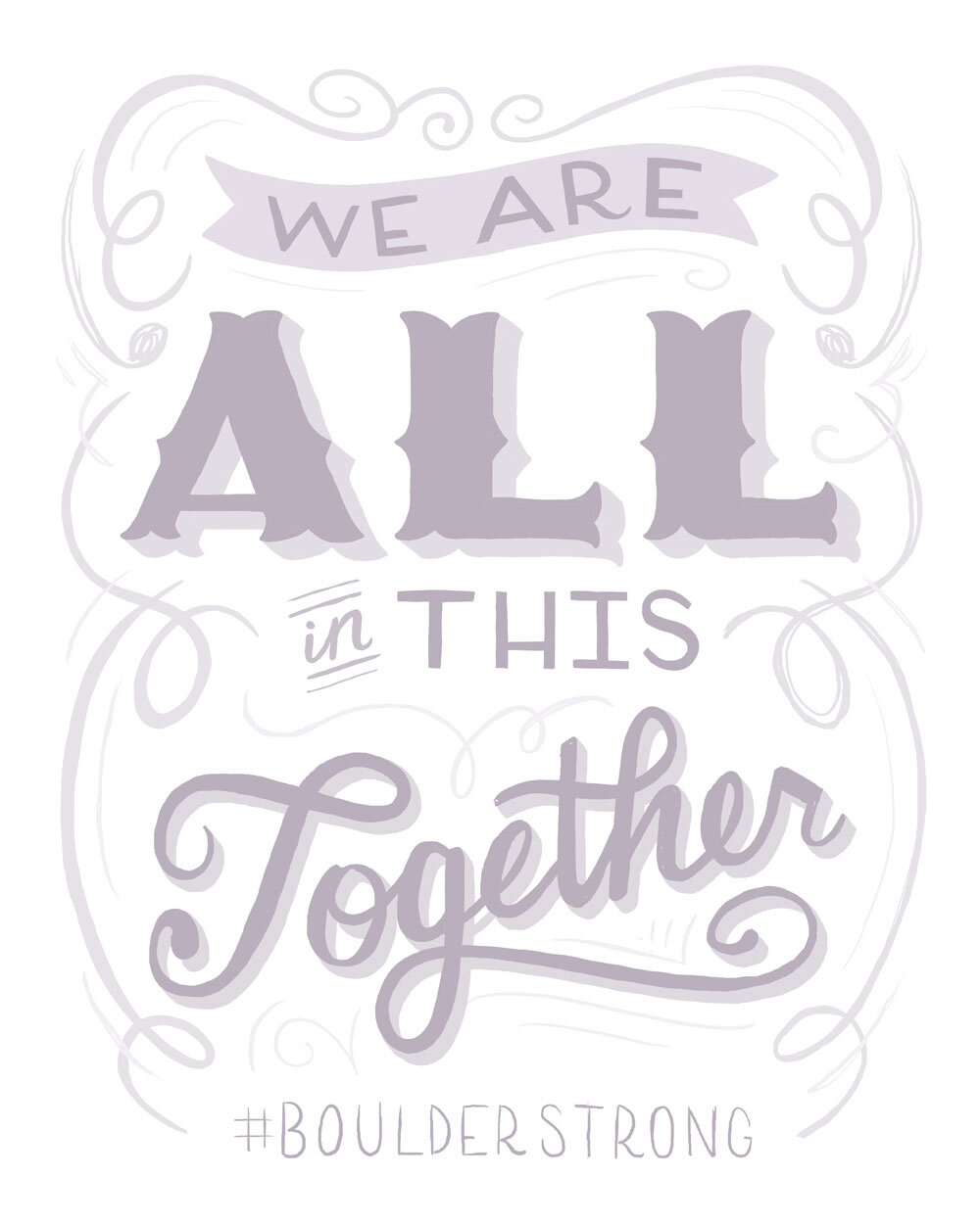

Todd gave me the freedom to follow my own artistic vision (best client ever), and here is the end result.

Using a vibrant color palette (to uplift and inspire hope), I wanted to include several people doing what we're all doing while staying home (reading, online learning, comforting one another through our collective uncertainty). The plants represent our growth, and the butterflies our evolution. My favorite part is the children literally climbing the walls as they play (as the mother of two elementary school aged children, I can really relate to this one).
Here are a few shots of the installation process as well.


This was one of the most meaningful and exciting projects I have ever had the opportunity to work on. Thank you so much to Todd and Market Real Estate for having the overall vision to make this happen. We truly are all in this together.
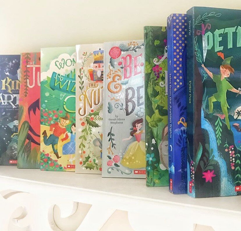
Jill Howarth's Scholastic Book Project!
Over the past 5 years, I have had the honor to work with the great folks at Scholastic on a series of re-designed classics book covers for the Scholastic Reading Club. From Alice in Wonderland to Little Women (with 15 covers in between!) this entire series has been a joy to work on. Anytime you can combine lettering with characters, not to mention on a product that gets great affordable literature into young hands, is a win.
On all of these covers, the parameters were fairly open, other than the top consideration that it reduces to thumbnail size clearly with good contrast for optimum readability.

Here are some initial pencils on the first title I worked on (and still one of my favorites) Alice in Wonderland. The book was to include a pocket watch pendant, so I incorporated the watch into the lettering in some of the sketches. Option 3 was chosen, with the caveat that Alice needed to be aged up. Simply lengthening her torso, cinching and lowering the waist and bingo, you have a tween Alice!


When going to color, I went with a dark background which ended itself to her mysterious decent into Wonderland as well as providing contrast and readability for the title. Favorite part? Angry flowers, of course!

Regroup + Recharge

It’s the end of February and a lot of you are probably just gotten back into the swing of things after the NYC trade shows. Even if you haven’t gone to a trade show, there are often big events and massive efforts that will occur throughout your time as an artist. Because of the nature of these events, which often require a ton of creativity, ingenuity, organization, and travel, they can be thoroughly depleting (nevermind the even bigger effort if you’re an introvert!).
So, how does one regroup and get back their energy after such an event?
For JNA, after a trip, this is our ideal way to recharge, if we can manage it!:
First, follow through. Recently, my son broke his first board in karate. It was amazing to see these kids approach the boards all gung-ho only to have their hands slow down when it came to the board. Child after child, they tried, got nervous, got even more nervous, and the board didn’t break. Then they finally realized they truly had to act like they were aiming for the floor. When they got over all the emotions and fears about following through, BAM! The board broke. This is all a long way of explaining that finishing what you start when you go to a trade show or land a commission is of the utmost importance to make it a true success.
Going out and getting new contacts or meeting with publishers is great but it is almost useless if you don’t follow through. You may be tired. You may be feeling nervous that nothing good came out of the trip. After all the work you might be tempted to wait and follow-up “later”. However, if you really want to recharge your batteries and get back that energy, following through and making a plan is essential. It releases your brain from the mental burden of having left things undone and also ensures that you’ve done all you need to, to make the effort a success.
First, write a report for yourself on how it went. Whether it’s a trade show, a commission, or a visit to a book fair, this can be an excellent tool. Write down what worked, what didn’t, what strategies you might want to use next time or things you’d like to learn about for the future. This report is a great way to collect your thoughts and milk every experience for the information you may not have processed while you were in the thick of it. It is also the perfect tool to prepare for future experiences.
Next follow-up with clients. Even if it’s just a thank you email that postpones more action until after you’ve recovered. For example, "Dear Pedro, thank you so much for meeting with me in New York. I will be in touch soon with that pitch we talked about.” Then, schedule when you will send the pitch (or whatever it is). Or, if you are up for it, send the pitch with the email and the entire thing is off your plate for the time being.
Then, take a break. I can’t recommend enough making time for a break as part of the planning process before a big event or commission even really begins. Give yourself what time you need to follow through—maybe one or two days, then schedule your break, again giving yourself whatever time you need to feel recharged. Set the auto-respond on your email and take that break! I encourage you to make it a real break where you don’t check your email or even think about work. Do something that you enjoy and that feeds your soul!
That’s it! After the break is over, get back to work 🙂. Coming back to the daily grind will be much easier after this series of steps. You will feel more creative, more open to new jobs, and more ready to tackle the next big effort that comes your way.
If you’d like to share ways you recharge your batteries after a major event, we’d love to hear about it! Jennifer and I offer Advice for Artists in a variety of ways, reach out if we can be a help to you. – Cathy
While you are there, don’t forget to sign up for our Advice for Artists Newsletter too!
Kelly Angelovic's most recent book project!
Kelly’s most recent book “Yes,Sisters” (just out this month) is already receiving 5-star ratings! Including this to-the-point review on Amazon:
“This book is a game-changer. The power of Yes combined with sisterhood! Great read!”
Kelly says, “This was such a fun project! Anything that promotes women and sisterhood speaks to my soul. Initially, the client asked for a sketch that showed 3-5 multi-ethnic women encircling the title, with botanical and seaside elements to connect them. I submitted the following two sketches based on this idea.”
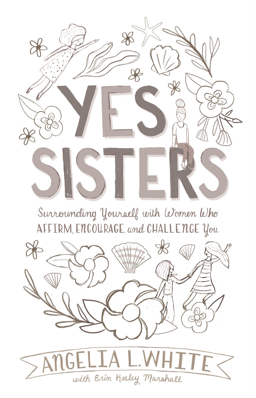
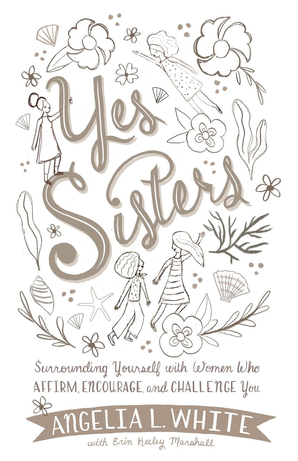
“Ultimately, we decided that this idea felt too busy, so we pared things down and proceeded from this revised sketch instead,” she says.

“For color, the client suggested a palette based on some of my existing work. I’m so pleased with how it all turned out!”

See the books promotional video:
You can order a copy of it here.