How to Find Contrast without Adding Black
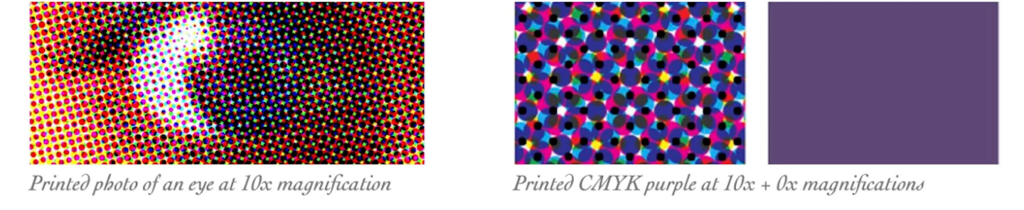
Have you heard the term CMYK? That is the acronym for Cyan, Magenta, Yellow, and Black. Those are the four colors of 4-color printing. These particular colors can be combined to make up a very large range of printed colors. Have you ever looked at printed material with a magnifying glass or a printer's loupe? If so, you will see tiny dots that make up the image or a "flat" color.
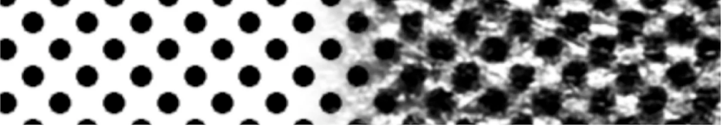
"Dot gain" is a phenomenon that causes printed material to look darker than intended. This happens when the diameter of halftone dots increases during the printing process. The specified color, the paper stock, the skill of the press operator and the printing press itself can cause this. Here is an amplified example of what happens when a nice flat black (left) gets printed on newspaper stock — look at how the dots get fuzzy and a lot bigger.
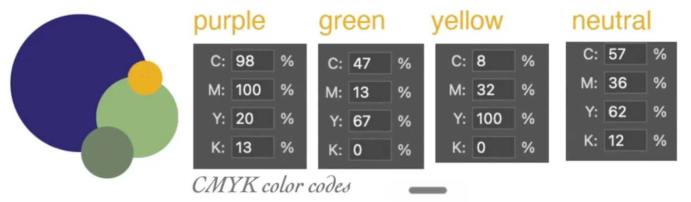
For this reason, many surface design clients avoid large expanses of black. I recommend that you consider mixing colors that include less than 15% black (especially over a large area of your composition). You can find such contrast in the colors that remain. For instance, in my example below, this deeply saturated purple balances really well against a lime green. And the warm yellow contrasts nicely with our neutral. Then, the neutral originated from the green (or it could come from the yellow) and makes the palette very rich.